Unit 9b. Population Growth and Urbanization
 Objective
The goal of this lab is to explore the relationship between population growth, urbanization and economic growth. Before coming to class read a brief article from the WorldWatch Institute entitled Urban Areas Swell, p. 105-107. The article will help us to get a sense of how urban environments are changing. We will then explore urbanization by region and country using ArcGIS with data from the United Nations. This data gives us information for the percent urbanization and total population every five years from 1950 to 2005 and projected to 2030.
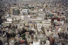
Figure 9.b.1
Arial picture of
Urban population
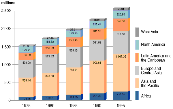
Figure 9.b.2
Urbanization by region from 1975 to 1995
http://www.unep.net
Investigate Urbanization with ArcGIS
Explore world urbanization and total population trends by country from 1950-2030. Open the master inquiries ArcGIS file. Save this as a new file named urbanization lab. In this way the master file will still be unchanged and available for future labs. The urbanization theme contains total population and percent urbanization data every five years from 1950-2030. First, right-click on the Urbanization theme and select Copy, then paste a copy of the theme at the top of the theme column (Edit à Paste). Keep the original Urbanization theme so you can copy it throughout the lab.
Double-click on the new Urbanization theme and under the general tab, change the name of the theme to 1950 Total Population and select Apply. Under the Symbology tab, create a graduated color legend for your new theme, using 1950 Total Population in 1,000's of people (TOTPO1950) as the classification field value. Select five natural breaks as the classification type and select the yellow to brown color ramp. Next, click on the classify button and write down the first four break values in the box on the right (10114, 36906, etc.). These break values will be used to classify other maps later in the lab. We will use 1950 Total Population as a baseline to see how population has increased over time from 1950 to 2005, and then projected up to 2030.
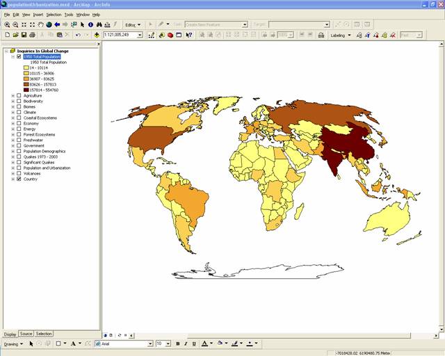
Figure 9.b.3
Total Population in 1950
To view how population has changed over time, add new data frames so we can view the maps simultaneously. In the toolbar click on the Insert button and select Data Frame. Click on the new data frame and rename it 1975. Drag the 1950 Total Population theme and the Country theme from the Inquiries in Global Change data frame down to the new 1975 data frame. Repeat this process two more times. Name the new data frames 2005 and 2030.
Right-click on each of the new data-frames and choose
properties from the menu. Select the Coordinate System tab, and in the box
showing the coordinate system trees, click the following links to find the
coordinates system desired: Predefined > Projected Coordinate System >
World > Flat Polar Quartic (world). Click OK. You
will get a warning but just click on the Yes button. The new data frame map
should change shape to match the Inquiries
In Global Change data frame map.
Under the 1975 data frame open the layer properties window for the 1950 Total Population theme. Under the general tab, rename the theme 1975 Total Population. Next, under the Symbology tab, change the classification field value to 1975 Total Population in 1000’s of people. (TOTPO1975). Click on the classify button and change the first four break values to the 1950 values that you recorded. Make sure to leave the fifth break value as it is. This will allow you to see the changes in population from 1950 to 1975 based on the break values (category breaks) for 1950. This will give a good visual representation of the changes in population around the world when we look at all four maps together.
Repeat the process for the themes in the 2005 and 2030 data frames. Recall that the frame that is highlighted in bold is the active frame, so if you do not see changes in your map as you make changes in your layer properties, you may not have the theme you are working in activated. To activate a data frame, right click on the data frame name and select activate. Once you have the 1950, 1975, 2005 and 2030 total population themes set up with the same projection and the same first four break values, change from the data view to the layout view by selecting View à Layout view. You should see all four maps on top of one another.
Next, go to File à Page and Print Setup and in the lower box called Map Page Size, select Landscape and select OK. Your layout view should change from a page layout to a landscape layout. Next, resize each of your four maps so they are the same size and do not overlap. Add titles to your maps as well by using Insert à Title as in figure 9.b.4. Add a legend to your layout using Insert à legend.
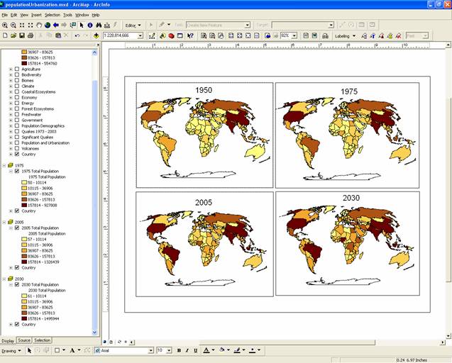
Figure 9.b.4
Layout view of Total Population from 1950 to 2030
Question
9.b.1
Globally, where do you see the greatest change in total population from 1950 to 2030? Is this a good method to examine changes in global population change? Why or why not?
Another way to examine population change is selecting countries by attribute. Right-click on the 1950 Total Population theme name and select open attribute table. Next, click on the options button and choose Select by Attributes. This tool tells the computer to return a set of map elements (i.e., countries) that match criteria you give it. We can compare 1950 and 2030 population values to examine total population change in a country or region. Examine whether there are any countries with a larger population in 1950 than the population numbers expected in 2030 by building the statement [TOTPO1950] > [TOTPO2030]. To select the countries with these attributes, you can either hand type it into the blank text box in the Query Builder, or you can double click the fields you want and single click the ">" symbol and the will appear automatically. This tells ArcGIS to highlight all the countries expected to have lower population in 2030 than they had in 1950. The highlighted countries will show up on your map in blue.
Question
9.b.2
What countries are expected to have smaller populations in 2030 than they did in 1950? Why might this be the case?
Next, examine urbanization patterns from 1950 to 2030. Copy the 1950 Total Population theme by right-clicking on the theme and paste it at the top of the Inquiries in Global Change data frame. Change the name of the new theme to 1950 Percent Urbanization. Change the classification field value to 1950 Percent Urban Population. Make sure you have 5 natural breaks selected and click on the classify button and write down the break values for the theme like you did for the 1950 Total Population theme.
Next, Activate the 1975 data frame by right-clicking on the theme and selecting activate. Copy the 1975 Total Population theme and paste it at the top of the 1975 data frame column. Change the name of the new theme to 1975 Percent Urbanization and change the classification field value to 1975 Percent Urban Population. Click on the classify button and change the first four break values to those of the 1950 Percent Urbanization. Complete this same process for the 2005 and 2030 data frames to examine changes in percent urbanization over time. Make sure to insert appropriate titles and a legend on your layout. When you are satisfied with your layout, export your map and save it as a JPEG to submit with your homework.
Question
9.b.3
What patterns are apparent for global rates of urbanization over time? Support this with your JPEG layout. Do you see any regional trends or differences between developed and developing countries?
Question
9.b.4
Make a table of the three countries with the greatest percent urbanization on the planet in 1950 and 2030. What do these countries have in common? (Hint: You can find these numbers by going to the attribute table, selecting the appropriate column header and sorting the data in descending order.) What are their values for their percent urbanization?
Question
9.b.5
What are two environmental or social costs and two benefits of increasing urbanization rates?
Next, drag a copy of the Economy theme from the Inquiries in Global Change data frame to the 1975 data frame. Turn off 1975 Percent Urbanization and activate the Economy theme. Open the layer properties window and change the name of the Economy theme to 2000 Per Capita GDP. Under the Symbology tab select Per Capita GDP (per capita GDP in millions $US per person for 2000 PC_GDP00) as the classification field value and select the yellow to brown color ramp. Next select 8 natural breaks as the number of classes and click on OK. In the layout view, change the title of your 1975 layout box to 2000 Per capita GDP.
Turn off all themes in the 2005 and 2030 data frames. Next, in the Inquiries in Global Change data frame, change the classification field value to 2000 Percent Urban Population. Make sure that the data is classified as five natural breaks. In your layout, change the title of the 1950 map to 2000 Percent Urbanization. Examine the relationship between percent urbanization and per capita GDP in the year 2000.
Question
9.b.6
Based on these two maps, describe the apparent relationship between per capita GDP and percent urbanization in 2000. Are there any regions that go against this pattern? What are some of the economic factors that might increase urbanization rates around the world? Are there different 'push' and 'pull' factors to increasingly draw people to urban areas for developed and developing nations?
Question
9.b.7
Select a region to examine in more detail. Make a JPEG layout that examines the relationship between urbanization and GDP. You will be assessed on your ability to select appropriate classification field values to create an interesting an informative map and chart combination. You will also be assessed on the clarity of presentation of the material you select. For example, you will be assessed on whether you have too much, or too little information and how it is visually assembled and presented.
The JPEG must contain at least one map of the continent or region you selected. Countries included in the map must be labeled. In addition, the JPEG must contain at least one stand alone graph. Maps must have appropriate legends, titles and units labels. Graphs must also have appropriate titles, axes and units labeled. Your name must be included on the map. In addition, you must turn in a clearly written and logical paragraph, which describes the relationships you present in your map and chart combination.
Helpful hints
- Make queries and label country names
on your map. Open the layer properties and select Definition Query.
Use the Query Builder and select a region to explore. Create a query
equation for the region you want to examine. For example, to examine
Western Africa, your query definition should read: [REGION] = '
- Insert charts into your layouts. Change your view to the Layout view. Right-click on the theme of your interest and select open attribute table. At the bottom of the attribute table select the options button. Under options, choose create graph and a new graph wizard window should open. Select the chart type that you wish to use, such as a column graph. Select next once you have selected your graph type. Next, the layer should be the theme name of the attribute table you selected to open. In the box, click the check box of the name of the theme that you want to graph. Make sure all other name are unchecked. Click on the next button. Choose an appropriate name for your graph and change the Title. You may also want to include a subtitle. Check the label X Axis with box and select NAME to see the names of each country in your region on the chart. Click the Label Data With Value box, as well as the Show Legend box. Next, click on the Show Graph on Layout box. Click on the Advanced options button to add titles to your horizontal and vertical axes. Click on Finish to return to your layout. In your layout window resize your graph.
Sources
http://ci.uofl.edu/tom/photos/Japan/tokyo-panorama.jpg