Unit 8b. Investigating Atmospheric Emissions
 Objective
Carbon dioxide (CO2) gas, primarily from the burning of fossil fuels and plant biomass, is considered one of the main drivers of increasing Earth surface temperature associated with global warming. Thus, understanding global patterns in CO2 emissions is of fundamental interest to our study of global change. Controlling atmospheric CO2 concentration is a fundamental challenge for human society should we collectively decide to avert what scientists have predicted to be a coming century of steady warming that could lead to serious economic, social, and ecological disruption.
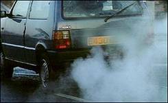
Figure 8.b.1
Exhaust from fossil fuel combustion
In addition to CO2, fossil fuel combustion and industrial technology also produce other atmospheric pollutants that have the capacity to alter the biogeochemistry of ecosystems and the composition of the atmosphere. In this lab you will explore how atmospheric pollutants have the potential to affect ecosystems and the atmosphere.
Carbon Dioxide Emissions
Examine and compare global patterns in total and per capita CO2 emissions. Open the Inquiries.mxd ArcGIS file and save the file under a new name. Copy the Climate theme and paste it at the top of the theme column or the top of the table of contents (Right-click à Copy Theme; Edit à Paste).
Double-click on the new Climate theme name to open the layer properties window. Under the General tab, change the name of the theme to Total CO2 Emissions and click on Apply. Under the Symbology tab, create a graduated color legend for your theme, using Total Carbon Dioxide (CO2) Emissions (in million metric tons in 1999, totCO2) as the classification field value. Pick any classification type and color scheme that you think is appropriate (e.g., five natural breaks and a dichromatic color ramp). Note that when you are comparing maps it is best to use a similar classification type so you can make easy comparisons between maps.
To view how total CO2 emissions differ from per capita emissions, add a new data frame so we can view two maps simultaneously. In the toolbar click on the Insert button and select Data Frame. Click on the new data frame and rename it Per Capita. Drag the Total CO2 Emissions theme and the Country theme from the Inquiries in Global Change data frame down to the new Per Capita data frame.
Right-click on the new data-frame and choose properties from the menu. Select the Coordinate System tab, and in the box showing the coordinate system trees, click the following links to find the coordinates system desired: Predefined > Projected Coordinate System > World > Flat Polar Quartic (world). Click OK. You will get a warning but just click on the Yes button. The new data frame map should change shape to match the Inquiries In Global Change data frame map.
Under the Per Capita data frame, open the layer properties window for the Total CO2 Emissions theme. Under the general tab, rename the theme Per Capita CO2 Emissions. Next, under the Symbology tab, change the classification field value to Per capita Carbon Dioxide (CO2) Emissions (in metric tons per 1000 people in 1999, pc_CO2). Classify your data in a similar manner to your Total CO2 Emissions theme map.
Recall that the frame that is highlighted in bold is the active frame, so if you do not see changes in your map as you make changes in your layer properties, you may not have the theme you are working in activated. To activate a data frame, right click on the data frame name and select activate. Once you have the total and per capita CO2 emission themes set up with the same projection and with a similar classification type, change from the data view to the layout view by selecting View à Layout view. You should see both maps on top of one another.
Next, resize each of your maps so they are the same size and do not overlap. Add titles to your maps as well by using Insert à Title. Add a legend to your layout using Insert à legend as in figure 8.b.2. Remember that the legend inserted will be from the active frame.
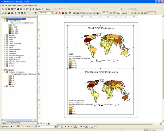
Figure 8.b.2
Layout view of total and per capita CO2 emissions
Question 8.b.1
What similarities and differences do you see between total and per capita CO2 emissions? Do the same countries remain in the highest emission category when you compare total vs. per capita measures? Which countries stay the same and which change?
Next, right-click on the Total CO2 Emissions theme name and select Open Attribute Table. Find the Total Carbon Dioxide (CO2) Emissions theme column and sort it in ascending order by right-clicking on the column name.
Question 8.b.2
Make a table of the five countries with the greatest total CO2 emissions on the planet, recording the corresponding values for their emissions. Make another table of the five countries with the greatest per Capita CO2 emissions with the corresponding values for their emissions.
Question 8.b.3
Are the emissions of countries in these top five lists relatively even or do one or several countries dominate total or per capita emissions? Which countries fall into both top five lists?
Question 8.b.4
What attributes do the countries with the highest CO2 emissions have in common?
Next, turn off all the themes in the Per Capita data frame. Copy the Total CO2 Emissions theme and use it to explore a continent or region or your choice in greater detail using the Query Builder. Turn off the original Total CO2 Emissions theme as well as the Country theme. Open the layer properties window for the new theme and give it an appropriate name. Under the Definition Query tab, click on the Query Builder button. Double-click on the words in the upper box to bring them into your workspace in the lower box. If you want to explore South America for example, build a query that states use: [CONTINENT] = 'South America' by double-clicking on [Continent], single-clicking on the equal sign button, clicking on the Get Unique Values button, then double-clicking on ‘South America’. When you are finished with your query statement, click on OK. All other countries besides your chosen region should disappear.
You may need to adjust the map classification for the region you selected so that all categories are displayed. To do this reopen the layer properties window and under the Symbology tab, switch your classification field value to another category, they reset the classification field value to Total Carbon Dioxide (CO2) Emissions. Add names to your countries by clicking the Label features in this layer box under the Labels tab in the layer properties window. Make sure that the Text string selected is NAME.
Next, copy your queried theme and paste a copy of it above the original. Rename the new theme Emissions by Sector. Use this theme to create a pie chart of some of the components that make up the total CO2 emissions data. Double click on the Emissions by Sector theme, and under the Symbology tab choose Charts and Pie as your classification field type in the left side box. Choose the pie chart and move the four themes below (Table 8.b.1) from the left to the right field. Make sure that the background symbol is hollow. You may want to adjust the size of your pie charts using the size button as well.
|
Classification
Field Value |
Abbreviated Name |
Units |
|
Industry CO2 Emissions |
indCO2_99 |
million metric tons |
|
Residential CO2 Emissions |
resCO2_99 |
million metric tons |
|
Transportation CO2 Emissions |
rdCO2_99 |
million metric tons |
|
Electricity and heat CO2 Emissions |
pubCO2_99 |
million metric tons |
Table 8.b.1
Emissions by sector
Question 8.b.5
What sector creates the greatest amount of CO2 emissions in the region you selected? How do these patterns change by country?
To better answer this question, add a chart to the bottom half of your layout that graphs the sector that has the greatest CO2 emissions by country. To do this, open the layer properties window of the CO2 emissions theme that is queried for a particular region. You should only see countries in the table that are present in that region. At the bottom of the attribute table, click on the Options button and select Create Graph (Figure 8.b.3).
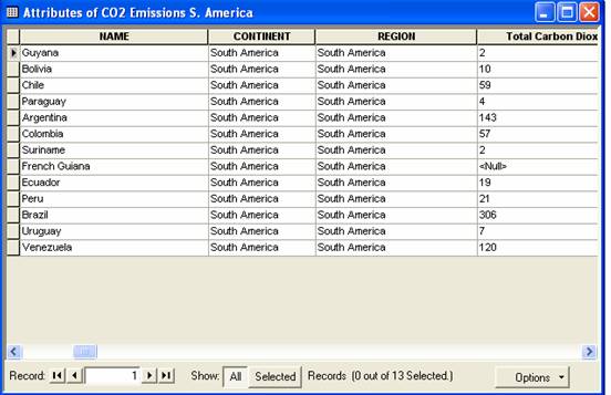
Figure 8.b.3
Attribute table
Select a column graph and choose next. Uncheck all categories in the middle lower box, then check the box next the emissions category that you would like to graph (Figure 8.b.4). Click on the next button.
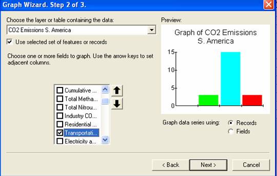
Figure 8.b.4
Selecting the category to graph
Click on next button and choose an appropriate title for the graph. Check all three boxes on the left side below the title and subtitle. Next, click on the Advanced Options button and insert appropriate axes labels (Figure 8.b.5) and click on Apply Now. Next, click on the trends tab and insert a mean line on the graph and hit OK.
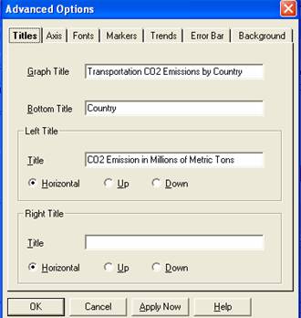
Figure 8.b.4
Selecting the category to graph
Lastly, make sure that the three buttons are checked underneath the title and subtitle. In addition, make sure that the Show Graph on Layout button is checked (Figure 8.b.5). Click on the Finish button. The chart should be visible on the layout. Resize the chart to fit in the bottom layout box. Make sure to remove any old titles and text that was present in the layout box.
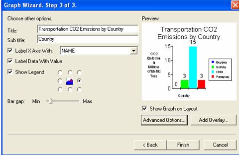
Figure 8.b.5
The final step to inserting a graph in the layout
When you are happy with your layout, export your layout map as a JPEG under File à Export Map. Make sure to save your map as a JPEG and turn it in with your homework. Your layout should look something like Figure 8.b.6
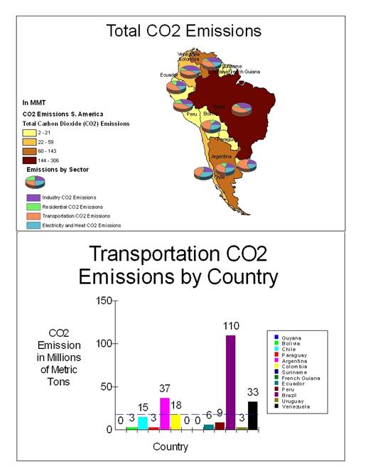
Figure 8.b.6
JPEG Layout
Other Emissions
CO2 is not the only atmospheric gas that is increasing due to human activities. Now explore some of the other components of the atmosphere that are being altered by fossil fuel combustion and technological advancement.
Create a copy of your Emissions by Sector theme. Rename the theme Methane and Nitrous Oxide. Double click on the theme and delete the themes in the right field. Add the themes in Table 8.b.2 to the field to create your new pie chart.
|
Classification
Field Value |
Abbreviated Name |
Units |
|
Methane emissions |
totMeth95 |
million metric tons |
|
Nitrous oxide emissions |
totNO2 |
million metric tons |
Table 8.b.2
Methane and Nitrous oxide
Using the internet, explore what causes Methane and Nitrous Oxide emissions.
Question 8.b.6
What factors contribute to the differences that you see between countries for these emissions? Explore what potential consequences we face do to increased Methane and Nitrous Oxide emissions? Please be specific about how Methane and Nitrous Oxide can affect the atmosphere and ecosystems on Earth.
Question 8.b.7
Using the attribute table, add up the total amount of Methane emissions for your continent or region. What is the value? How does this value compare with the total CO2 emission for the same region?
Lastly explore Sulfur Dioxide (SO2), Nitrogen Oxides (NOx), Carbon Monoxides (CO) and Non-Methane Volatile Organic Compounds (VOC’s). Do this in the same way that you did for exploring Methane and Nitrous Oxide. Create a copy of your Methane and Nitrous Oxide theme. Rename the theme Other Pollutants. Double click on the theme and delete the themes in the right field. Add the following themes to the field to create your new pie chart.
|
Classification
Field Value |
Abbreviated Name |
Units |
|
Sulfur Dioxide |
SO2_95 |
1000 metric tons |
|
Nitrogen Oxides |
Nox_95 |
1000 metric tons |
|
Carbon Monoxide |
CO_95 |
1000 metric tons |
|
Non-methane Volatile Organic Compounds |
VOC_95 |
1000 metric tons |
Table 8.b.3
Other pollutants
Question 8.b.8
Determine what human activities cause SO2, NOx, CO and VOC emissions. What factors contribute to the differences that you see between countries for these emissions? How do these compounds affect ecosystems and the atmosphere? Please be specific about how SO2, NOx, CO and VOC’s can affect the atmosphere and ecosystems on Earth.
Sources
http://news.bbc.co.uk/media/images/38261000/jpg/_38261905_carexhaust300.jpg