Unit 7b. Global Energy Resources - Population and Consumption
Objective
In this exercise, we will examine spatial patterns of global energy consumption using ArcGIS. Production and consumption of fossil (oil, gas, coal, etc.), traditional (fuelwood, animal waste, etc.) and modern renewable energy consumption will be compared among countries. Energy consumption and use trends will also be related to national wealth (GDP).
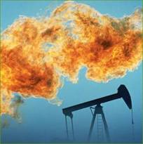
Figure 7.b.1
Oil fire
This topic is of inherent interest to our studies of Energy and Global Change because the economic transition of countries from less developed to more developed states, is often accompanied by a transition in the main sources of energy used by a society. This transition in dominant energy sources, in turn, leads to a number of potential environmental consequences, both positive and negative.
Investigate Energy with ArcGIS
Open the ArcGIS master file and save it under a new name. Copy the Energy theme and paste two copies at the top of the theme column (Right-click à Copy themes then Edit à Paste).
For one of the new Energy themes, double-click on the theme to open the layer properties window. Under the general tab rename the theme Total Energy Consumption. Next, click on the Symbology tab and create a graduated color legend using the Red to Green to Dark Blue color ramp. Select Total energy consumption from all sources (in 1000 metric tons oil equivalent TOTCONS99) as the classification field value. Classify the legend by natural breaks into 5 classes. Right-click on the symbol boxes and select flip symbols. This will make countries with high total energy consumption red and countries with low total energy consumption blue. Next, right click on the symbols and select Properties for All Symbols. Change the outline color for the countries to black. Click on OK two times to close the layer properties window. Your map should look something like Figure 7.b.2. You can click on the plus sign next to the theme name to see the legend scale.
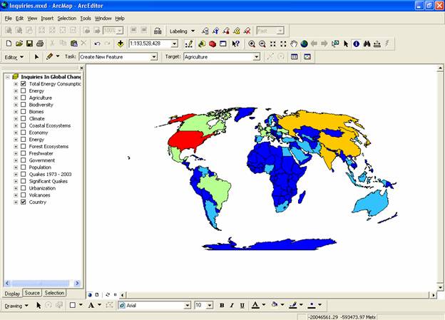
Figure 7.b.2
Global energy consumption
Question 7.b.1
What countries stand out in this
map and why? What do some of the high energy-consuming countries have in
common? You may want to use the Identify button ![]() to gather information on these countries.
to gather information on these countries.
Name your second copy of Energy theme Per Capita Energy Consumption (in 1000 metric tons oil equivalent per 1000 people). Under the Symbology tab in the layer properties, change the classification field value to Per Capita energy consumption from all sources (in 1000 metric tons oil equivalent per 1000 people, PC_CONS99). Choose five natural breaks for the classification. Make sure that your legend colors are the same as the Total Energy Consumption theme. If the symbol color order is not the same between the two themes, right-click on the symbols and select Flip Symbols to make countries with high rates of consumption show up in the red spectrum and countries with low consumption show up in the blue spectrum. Make sure that the outline color for the countries is black. Once you have finished modifying your Symbology, click on OK.
Next, choose Insert and select Data Frame. Click on the new
data frame and rename it Per Capita. Click
on the Per Capita Energy Consumption theme within the Inquiries In
Global Change data frame and drag it down into the Per Capita data frame. Deactivate the original Per Capita Energy
Consumption theme. Drag Country from the Inquiries In Global Change data frame down to the Per Capita data frame as well.
Now select View à Layout View. The two data frames should be visible in the middle of the layout page. The new frame should be highlighted with a blue box, indicting that it is the active frame. The active frame is also shown in boldface type in the theme column or table of contents. Next, resize both frames so they are the same size and do not overlap on the page.
Set the map projection of the new frame so that the new frame can have the same projection with the Inquiries In Global Change frame. Right-click on the Per Capita data-frame and choose properties from the menu. Select the Coordinate System tab, and in the box showing the coordinate system trees, click the following links to find the coordinates system desired: Predefined > Projected Coordinate System > World > Flat Polar Quartic (world). Click OK. You may get warning, just click on the Yes button. You should be able to see the Per Capita data frame map change shape to match the Inquiries In Global Change data frame map. Use the Zoom tool to enlarge the maps inside the layout frame boxes. Click on the Zoom in magnifying glass and make a box around the area in which you would like to become larger.
Now insert appropriate titles on the maps using Insert à Title. Add legends and units to your layout view as well. When you are happy with your layout export your map and save it as a JPEG to turn in with your lab assignment.


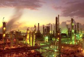
Figure 7.b.3
Traditional fuelwood gathering
Figure 7.b.4
Fossil fuel consumption
Figure 7.b.5
Oil refinery
Question 7.b.2
In your WORD document, make a
table that lists the five countries with the highest total energy consumption
and lists the five countries with the highest per 1000 person energy
consumption. Make sure to provide values for each country (by using the
attribute table) with the appropriate units. (Recall that you can open the
attribute table of a theme by right-clicking on the theme name and selecting
open attribute table.) How do the global total energy consumption and per 1000
person energy consumption patterns differ? Support this with your JPEG layout.
Return to the data view (View à Data View). Turn off the themes in the Per Capita data frame. Reactivate the Inquiries In Global Change frame by right-clicking on the name and selecting Activate. In the Inquiries In Global Change data frame, change the color ramp for the Total Energy Consumption theme to yellow to dark brown. Next, copy the original Energy theme and paste a copy at the top of the theme column and activate it. Use this theme to explore the components that make up the Total Energy Consumption data. Name the new theme Energy Use. Under the Symbology tab in the layer properties window, on the left side, select Charts. Then select pie as your chart type.
Move the five themes below (Table 7.b.1) from the left (field selection) to the right field. Make sure that the background symbol is hollow. You may want to adjust the size or tilt of your pie charts using the properties button in the legend editor. You may also want to adjust the color for each of the energy types to view the pie chart more easily (Figure 7.b.7). When you are satisfied with you pie chart properties, click on OK. Use the zoom and pan keys to move around the world and examine different areas. Right-click on the Energy Use theme and select open attribute table. By right-clicking on the theme names within the attribute table you can sort the data in ascending or descending order.
|
Classification
Field Value |
Abbreviated Name |
Units |
|
Total fossil fuel consumption |
TOTFFUEL99 |
1000 metric tons Oil Equivalent |
|
Total nuclear consumption |
TOTNUCL99 |
1000 metric tons Oil Equivalent |
|
Total hydroelectric consumption |
TOTHYDR99 |
1000 metric tons Oil Equivalent |
|
Total modern renewable energy consumption (i.e. solar and wind) |
TOTRENW99 |
1000 metric tons Oil Equivalent |
|
Total traditional renewable energy consumption |
TOTTRAD99 |
1000 metric tons Oil Equivalent |
Table 7.b.1
Energy consumption by energy type
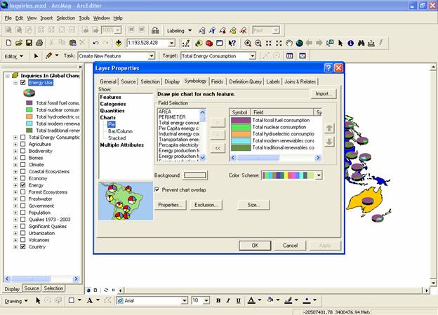
Figure 7.b.6
Creating a pie chart
Question 7.b.3
Using the attribute table, for
each of the five fuel types in the pie chart, determine which two countries use
the most of each energy type. In your WORD document, make a table that shows
the values for each country with the appropriate units. What kinds of global
trends do you see?
Question 7.b.4
In your WORD document, make a table and describe two possible environmental costs and two benefits for each of the five energy types in your pie chart? You may need to use the internet to search for this information.
Now, take a closer look at patterns in
You should now see only

Figure 7.b.7
Definition Query for
Now return to the layout view. You should see
Next, the layer should be the theme name of the attribute table you selected to open. In the box, click the check box of the name of the theme that you want to graph, in this case choose Per Capita energy consumption from all sources. Make sure all other names are unchecked. Click on the next button. Choose an appropriate name for your graph and change the Title. You may also want to include a subtitle. Check the label X Axis with box and select NAME to see the names of each country in your region on the chart. Click the Show Legend box. Next, click on the Show Graph on Layout box. Click on the Advanced options button to add titles to your horizontal and vertical axes. For example make the left title Per Capita Energy Consumption in 1000 Metric Tons Oil Equivalent per 1000 People. Click on the OK button. Make sure to re-click the Show Graph on Layout box. Then click on Finish to return to your layout. In your layout window resize your graph to fit the bottom data frame box as in figure 7.b.8.
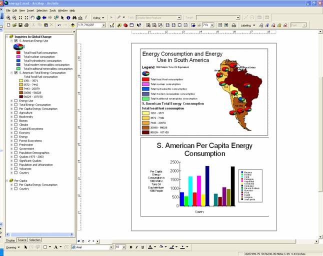
Figure 7.b.8
Inserting charts into layouts
Examine your map closely. When you are happy with your map, export it as a JPEG and turn it in with your lab assignment.
Question 7.b.5
What is the dominant energy type
used in
Turn off the S. American Total Energy Consumption and S. American Energy Use themes. Move the chart to the side of the layout so it does not cover your Per Capita data frame. Copy the Economy theme and paste it at the top of the theme column. Double-click on the theme to open the layer properties and under the general tab rename the theme Per Capita GDP. Under the Symbology tab, select Per Capita GDP (in millions $US per person, PC_GDP00) as the classification field value with 8 natural break categories. Select the Red to Green to Dark Blue color ramp with red symbolizing the highest values of GDP. Turn on the Per Capita Energy Consumption theme under the Per Capita data frame.
Open the layer properties for Per Capita Energy Consumption and classify it with 8 natural breaks. Make sure the red colors symbolize the highest energy consumption values. If red does not represent the highest values, right-click on the symbols and select flip symbols. Alternatively, if you prefer, choose the yellow to brown color ramp for both themes. Alter the legends and titles so they are appropriate for your current map as in figure 7.b.9. You can change the style of your legend by double clicking on the legend and selecting the Items tab. Then double-click on the theme name in the upper right-hand box to open the legend item selector window to choose a legend style.
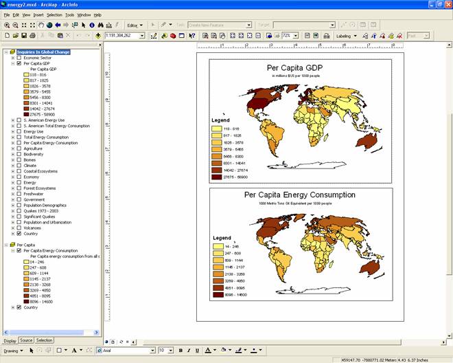
Figure 7.b.9
Comparison of Per Capita GDP and Energy Consumption
Question 7.b.6
Based on this map, describe the apparent relationship between per capita GDP and per capita energy consumption. Explain why this relationship might occur.
Return to the data view when you have finished examining the relationship between per capita GDP and energy consumption. Next, examine what percent or GDP comes from different sectors of the economy. In the Inquiries In Global Change data frame, copy the Economy theme and paste a copy at the top of the theme column and activate it. Use this theme to explore the components that make up the Per Capita GDP data. Name the new theme Economic Sector. Under the Symbology tab in the layer properties window, on the left side, select Charts. Then select pie as your chart type. Move the three themes below (Table 7.b.2) from the left (field selection) to the right field. Make sure that the background symbol is hollow. You may want to adjust the size or tilt of your pie charts using the properties button in the legend editor. You may also want to adjust the color for each of the energy types to view the pie chart more easily. When you are satisfied with you pie chart properties, click on OK. Use the zoom and pan keys to move around the world and examine different regions.
|
Classification
Field Value |
Abbreviated Name |
Units |
|
% GDP by Agriculture |
GDP_AG00 |
Percent |
|
% GDP by Industry |
GDP_IND00 |
Percent |
|
% GDP by Services |
GDP_SVC00 |
Percent |
Table 7.b.2
Percent GDP by sector
Question 7.b.7
What global and regional trends do you see for GDP by sector? How does this relate to energy consumption patterns? If the majority of less developed countries in the world’s economies shift to a more serviced based economy, what might this mean for global climate and the environment?
Question 7.b.8
Examine the economy and patterns
of energy consumption in
The JPEG must contain at least one
map of Europe, or part of
Sources
http://www.atwitsend.org/Oil%20Refinery%20CA.jpg
http://i.cnn.net/cnn/2002/US/12/05/gas.pump.fires/story.generic.gas.pump.jpg
http://www.iucn.org/themes/fcp/images/fulew_bill_jackson.jpg
http://www.distributiondrive.com/Oil%20Well%20and%20FireSM.jpg