Unit 6b. Population Demographics: HIV/AIDS
 Objective
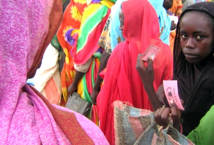
The United Nations AIDS program (UNAIDS) concludes that globally the number of people living with HIV (Human Immunodeficiency Virus) continues to rise from 35 million in 2001 to 38 million in 2003. More than 20 million have died since the first cases of AIDS (Acquired Immune Deficiency Syndrome) were identified in 1981 and the rate of infection is increasing every year (UNAIDS, 2004).
Figure 6.b.1
Population in
HIV/AIDS hinders human development, exacting a devastating toll on individuals and families. In the hardest-hit countries, it is erasing decades of health, economic and social progress. HIV/AIDS is also reducing life expectancy by years, deepening poverty, and contributing to and exacerbating food shortages (UNAIDS, 2004). In this lab you will examine the relationship between population growth and demographics with HIV/AIDS Infection rates.
Introduction
UNAIDS (2004) lists some of the major challenges associated with the HIV/AIDS epidemic:
- The
risk of HIV infection for women is increasing. As of December 2003, women
accounted for nearly 50% of all people living with HIV worldwide and for
57% in sub-Saharan
- Young people, specifically 15-24 year olds account for nearly half of all new HIV infections worldwide. This generation is the largest in history and if they are to play a part in combating the epidemic, they need regular schooling and access to health and support services.
- Only 7% of the people who need antiretroviral (ARV) treatment in developing countries have access to them (400 000 at the end of 2003). Programs must be sustainable to prevent the development of drug-resistant strains of the virus.
- Several
countries in southern
- In low- and middle-income countries in 2003, only one in ten pregnant women were offered services for preventing mother-to-child HIV transmission. In high-income countries, treatment has been a much higher priority than prevention and as a result, there have been rises in HIV transmission for the first time in a decade.
- The stigma and discrimination associated with HIV/AIDS directly hampers the effectiveness of AIDS responses, stop people being tested for HIV, prevent the use of condoms or HIV-positive women breastfeeding to protect their babies against infection, and prevent marginalized groups such as injecting drug users receiving the care and support they need.
- AIDS
has killed one or both parents of an estimated 12 million children in
sub-Saharan
Explore HIV/AIDS with ArcGIS
 Open
the Inquiries.mxd ArcGIS
file and save the file under a new name. Copy the Demographics theme and paste a copy of it at the
top of the theme column or the top of the table of contents (Right-click à
Copy, Edit à
Paste). Keep the original Demographics theme so you can copy it throughout the lab.
Open
the Inquiries.mxd ArcGIS
file and save the file under a new name. Copy the Demographics theme and paste a copy of it at the
top of the theme column or the top of the table of contents (Right-click à
Copy, Edit à
Paste). Keep the original Demographics theme so you can copy it throughout the lab.
Figure 6.b.2
African woman
Double-click on the new Demographics theme and under the general tab, change the name of the theme to 2002 Total Population and select Apply. Under the Symbology tab, create a graduated color legend for your new theme, using Total Population 2002 in 1,000's of people (TOTPOP_02) as the classification field value. Select five natural breaks as the classification type and select the yellow to brown color ramp. Next, click on the classify button and write down the first four break values in the box on the right (17040, 48956, etc.). These break values will be used to classify other maps later in the lab. We will use 2002 Total Population as a baseline to see how population will increase over time from 2002 projected up to 2025.
To view how population will change over time, add a new data frame so we can view two maps simultaneously. In the toolbar click on the Insert button and select Data Frame. Click on the new data frame and rename it 2025. Drag the 2002 Total Population theme and the Country theme from the Inquiries in Global Change data frame down to the new 2025 data frame.
Right-click on the new data-frame and choose properties from
the menu. Select the Coordinate System tab, and in the box showing the
coordinate system trees, click the following links to find the coordinates
system desired: Predefined > Projected Coordinate System > World >
Flat Polar Quartic (world). Click OK. You will get a
warning but just click on the Yes button. The new data frame map should change
shape to match the Inquiries In Global Change data frame map.
Under the 2025 data frame, open the layer properties window for the 2002 Total Population theme. Under the general tab, rename the theme 2025 Total Population. Next, under the Symbology tab, change the classification field value to 2025 Total Population in 1000’s of people. (TOTPOP_25). Click on the classify button and change the first four break values to the 2002 values that you recorded. Make sure to leave the fifth break value as it is. This will allow you to see the changes in population from 2002 to 2025 based on the break values (category breaks) for 2002. This will give a good visual representation of the changes in population around the world when we look at the two maps together.
Recall that the frame that is highlighted in bold is the active frame, so if you do not see changes in your map as you make changes in your layer properties, you may not have the theme you are working in activated. To activate a data frame, right click on the data frame name and select activate. Once you have the 2002 and 2025 total population themes set up with the same projection and the same first four break values, change from the data view to the layout view by selecting View à Layout view. You should see both maps on top of one another.
Next, resize each of your maps so they are the same size and do not overlap. Add titles to your maps as well by using Insert à Title. Add a legend to your layout using Insert à legend as in figure 6.b.3. Remember that the legend inserted will be from the active frame.
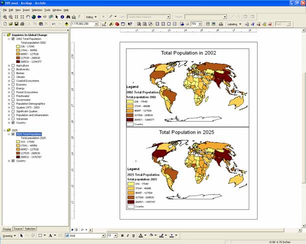
Figure 6.b.3
Layout view of population in 2002 and 2025
Question 6.b.1
Why is it necessary to change the break values of the second map?
Question 6.b.2
What trends do you see in total population from 2002 to 2025? Are there any countries that seem to lose population from 2002-2025?
It is somewhat difficult to view population change information on the map that we have created, so let’s examine this trend in another way. First Return to the data view by selecting View à data view. Activate the Inquiries in Global Change data frame by right-clicking on it and selecting activate. Next, copy the 2002 Total Population theme and paste it at the top of the theme column. Rename the new theme Pop Change 2000-2005.
Under the Symbology tab select 2000-2005 Total average annual population change (in percent or avgchng_05) as the classification field value. Classify the data into three natural breaks. Natural Breaks asks ArcGIS to find gaps in the data values and clump the data according to its naturally occurring groups of values. Next, click on the Classify button and change the first break value to zero. By doing this we will be able to clearly see which countries have negative rates of population growth, small percent increases in population and large percent increases in population.
Next, right-click on the Pop Change 2000-2005 theme name and select open attribute table. Find the population change theme that you have just created a map of, right-click on the column name and sort the data in ascending order.
Question 6.b.3
Make a table of the five countries with the greatest decrease in population and the corresponding values, and the five countries with the greatest increase in population from 2000-2005 with the corresponding values. Explain why having a population crisis with either too many or two few people might be problematic.
Activate the 2025 data frame by right-clicking on the data frame name and selecting activate. Use this data frame to explore trends in HIV/AIDS. Copy your 2025 Total Population theme and paste it under the 2025 data frame name. Turn off the original 2025 Total Population theme. Change the name of the new theme to HIV/AIDS. Change the classification field to Adults living with HIV or AIDS (in 2001 as percent of the total population, Adlthiv_01) and design your own legend. Try different classification types and numbers of classes. Your maps may look something like Figure 6.b.4.
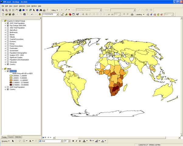
Figure 6.b.4
HIV/AIDS theme
Question 6.b.4
Describe two different configurations used to classify the data. How did they change the way your data appeared? Describe an advantage of each classification type and which you prefer.
Compare HIV/AIDS with Pop Change 2000-2005. An easy way to do this is to return to the layout view. You may need to resize your maps and alter your titles.
Question 6.b.5
What obvious trend do you see? What factors might contribute to this trend?
Now explore how much countries spend on health care. Copy the Government theme from the Inquiries in Global Change and paste it at the top of the theme column. Turn off the Pop Change 2000-2005 theme. Rename the new Government theme, Public Health. Next, create a map of Government expenditures on public health (in percent of GDP, Zpubhlth). Choose an appropriate color scheme and data classification for your new map.
Question 6.b.6
Which countries have high expenditures for health care? How does this relate to the HIV/AIDS epidemic?
Now choose a country in ![]() and clicking on the country of interest.
Another option to inquire about specific countries is to use the CIA's World Factbook to research a country's profile (http://www.cia.gov/cia/publications/factbook/).
and clicking on the country of interest.
Another option to inquire about specific countries is to use the CIA's World Factbook to research a country's profile (http://www.cia.gov/cia/publications/factbook/).
In addition to the internet search, create a layout of
Limit the coverage of your map to
Finally, make another copy of the HIV/AIDS in … theme and name it Pop Demographics. Under the Symbology tab, change the legend type in the Pop
Demographics theme to Chart,
and create an appropriate chart
theme under Chart Type on the
left. Create a chart of the two-three themes that you think are important
factors affecting HIV/AIDS infection in your country. For example you could use
Total fertility rate 1975-80 (fert80) and
Total fertility rate 2000-05 (fert05) to explore population dynamics if
you think they are important. Move the chart theme to the top and make sure to
make the background color transparent. You may need to adjust the size of the
chart and zoom ![]() in on your continent. You should be able to
see individual charts for each country on your continent as in figure 6.b.5.
in on your continent. You should be able to
see individual charts for each country on your continent as in figure 6.b.5.
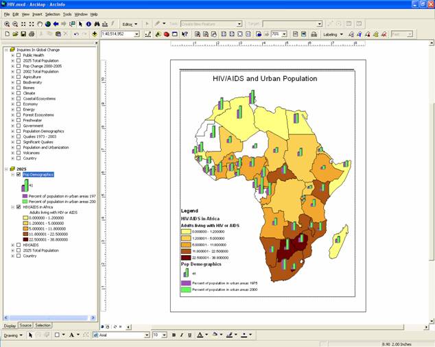
Figure 6.b.5
Creating a layout
Within the layout, you can adjust the size and configuration of the various components by selecting them and dragging them or using the arrow keys (to move them), or dragging them from the corners (to resize them). Make sure that your layout contains appropriate legends and titles.
Once you are satisfied with the appearance of your layout, go to File à Export, navigate to the folder you want to save it in, and select JPEG from the "List files of type:" pull-down menu. Then give your file a name, and press OK. This will export your layout as a JPEG image file to the location you specified. If you navigate to this file and open it, you can verify its appearance.
Question 6.b.7
Using your internet search and
layout map, what did you discover about your country that might give you
context to better understand HIV/AIDS infection rates? What would you do to ameliorate
any HIV/AIDS and population problems in your country, and in
Sources
http://www.worldrevolution.org/newsfeature/23
http://www.ers.usda.gov/amberwaves/june04/features/images/asiapacific.jpg
http://www.unaids.org/bangkok2004/GAR2004_html/ExecSummary_en/ExecSumm_en.htm#P15_98