Unit 5b. Global Water Resources
 Objective
Many scholars predict that water will be the most limiting resource to human life and activities in the future, to the point where wars will be fought over it, and access to water will determine, more than any other factor, a country’s ability to support its population and achieve economic success. In this exercise you will conduct a spatial examination of global water resources, withdrawals, and predicted future water needs, using ArcGIS GIS.
Figure 5.b.1
City water
Before Coming to Class
Please familiarize yourself with global water resource issues by reading a short article. The article is from the WorldWatch Institute and is entitled Hydrologic Poverty Worsening. You should also look at the PowerPoint Presentation by the WorldWatch Institute entitled, Boosting Water Productivity.
In Class
Open the Inquiries ArcGIS file and save the file under a new name. Copy the Freshwater theme and paste one copy of it at the top of your theme column (Right-click à Copy, Edit à Paste). This theme contains data on freshwater resources and withdrawals for each country, which is of primary interest for this lab exercise. Start by activating the new Freshwater theme map by clicking on the check box next to the theme name. Double-click on the top Freshwater theme to open the Layer Properties window.
Under the general tab, change the name of this new theme to Total Freshwater. Next, under the Symbology tab, choose Total Natural Renewable Water Resources (total km3 of natural renewable water resources in 2002) as the value field and choose 7 natural breaks (jenks) in the classification box. Choose red to yellow to blue as the color ramp.
When activated your total freshwater map should look like Figure 5.b.2.

Figure 5.b.2
Map of total natural renewable water resources
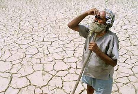
Figure 5.b.3
Man in drought
Choose a country in the world to explore in more detail.
Question 5.b.1
How many km3 of annual
renewable water does the country you selected to examine have? (Use the
identify tool button ![]() .) Is the
country relatively water rich or water stressed? What are you basing your
opinion on?
.) Is the
country relatively water rich or water stressed? What are you basing your
opinion on?
Question 5.b.2
What factors do you think influence water resource availability in the country you selected to explore?
Next, make a copy of the Total Freshwater theme and turn off the original Total Freshwater theme. Change the name of the copy of the Total Freshwater theme to Per Capita Freshwater. At this point, do not change your Symbology.
Explore per capita freshwater availability by joining the Per Capita Freshwater and Urbanization themes
together. Double-click on Per Capita
Freshwater to open the layer properties window. Next go to the Joins &
Relates tab. In the top pull down menu, select Join attributes from a table. In
pull down menu number one, select Name. In the second pull down menu select Urbanization
to join the population table to the Per Capita Freshwater
table. In the third pull down menu,
select Name, then click on OK (Figure 5.b.3).
The program may ask you to create an index. Select yes. Then click on
Apply. This should join the Urbanization
and Freshwater attribute tables into
one table so you can explore Per Capita
Freshwater resources.
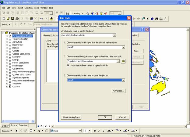
Figure 5.b.3
Joining data tables
Return to the Symbology tab. In the classification field value you should
see freshwater: TOTRNWH20 (Total
Natural Renewable Water Resources). In
the field below, normalize your data by urbanization: TOTPO2005 (total
population in 2005). If you can not see the whole name, select any symbol and
hover over the symbol name with the mouse. A box should appear that show the
whole field category name.
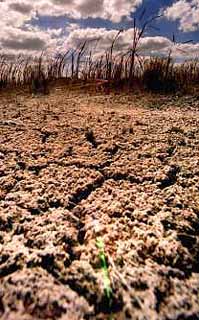
Figure 5.b.4
Dry soil
Click back a forth between the Per Capita Freshwater and Total Freshwater themes.
Question 5.b.3
What changes do you see?
Next, open the layer properties
window for Per Capita Freshwater. Click on the Classify button and select Quantiles. Then set the top break value to 0.001
(cubic kilometers of renewable water per 1000 people per year). This is the threshold for "highly
stressed" per capita water supply. By classifying the legend in this
manner you can simply look for the lowest legend category on the map and see
the countries that fall below the level of chronic
water scarcity. Note that changing the break values will change your
classification from Quantiles to Manual.
Write down the all break values for the Per Capita Freshwater theme (starting with 0.001). We will use these numbers in the next step. Then create a copy of the Per Capita Freshwater theme and rename it 2025 Per Capita Freshwater. Turn on the new theme then normalize the legend by the urbanization: Totpo2025 field, and create a legend using the break values (or the range values) from the Per Capita Freshwater.
Examine the legends carefully to make sure that they have category breaks that match to make an accurate comparison between years. Make sure the 2025 Per Capita Freshwater theme is on top to examine the data by clicking and un-clicking the top theme.
Another option to examine data is to create a second data frame so you can examine two maps concurrently. Go to View on the menu bar and select Layout View. Also on the menu bar, choose Insert and select New Data Frame. Double-click on the new data frame and give it an appropriate name.
The new data frame should appear with a set size in the middle of the layout page highlighted with blue handles, indicting that it is the active frame. The active frame is also shown in boldface type in the theme column or table of contents. Next, resize both frames so they are the same size and do not overlap on the page. Use the Zoom tool to select the appropriate sized map inside the layout frame box.
Next, click on one of the themes that you would like to compare and drag it down into the new data frame. Set the map projection of the new frame so that the new data frame has the same projection with the Inquiries In Global Change frame. Right-click on the new data-frame and choose properties from the menu. Select the Coordinate System tab, and in the box showing the coordinate system trees, click the following links to find the coordinates system desired: Predefined à Projected Coordinate System à World à Flat Polar Quartic (world). Click OK. You may get warning but just click on the Yes button.
This should change the new data frame map to match the Inquiries In Global Change data frame map. Select View à Zoom layout to increase or decrease the size of your maps. Recall that you can add relevant text to the map by selecting Insert à Title, Legend etc from the menu bar.
Examine the maps carefully to see which countries experience a change in per capita water resources between now and 2025.
Question 5.b.4
Considering the population of the
country you selected to examine, would you consider it water-rich,
water-scarce, or somewhere in between? (Use the identify tool ![]() to look at this.) Why? What about in 2025?
to look at this.) Why? What about in 2025?
Yet, another way to examine patterns is to use a query. A query tells the computer to return a set of map elements (i.e., countries) that match criteria you give it. In this case, because the water resource values we are using are constant and only the population values are changing, we can simply compare current and 2025 population values to get an idea of how per capita water availability might change in a country.
First, make sure you are in the data view and turn off the Per Capita Freshwater theme. Right-click on the Inquiries in Global Change data frame and select Activate. Next, under layer properties, go to the query definition tab for 2025 Per Capita Freshwater and press the Query Builder button. Build the statement “urbanization.TOTPO2025 < urbanization.TOTPO2005” and press OK.
To build this query, you can either hand type it into the blank text box in the Query Builder, or you can double-click the fields you want and single click the "<" symbol and the statement will appear automatically. By clicking on the categories, you avoid making typing mistakes, which will prevent your query from working.
The statement you have built tells ArcGIS to highlight all the countries expected to have lower population in 2025 than they had in 2005 (i.e., those countries that, given the assumption of equal total water availability, will have more water per capita in 2025). All countries that show an increase in population from 2005 to 2025 should disappear leaving only countries that will decrease in population over that time period.
Question 5.b.5
What assumptions about water resources are we making with these future predictions? Are they reasonable, and why or why not? Aside from population growth, name several reasons why a country might experience future water shortages.
Activate the Per Capita Freshwater theme and open its attribute table by right-clicking on the theme name and selecting open attribute table from the menu. The attribute table associated with a given theme stores all of the raw data used to create and normalize the maps we make and manipulate. Sort the data in ascending order by Total Natural Renewable Water Resources and look at the results. In order to sort a particular field you need to click on the desired heading in the table and then right-click on the top of the column and choose sort ascending from the menu.
Question 5.b.6
What are the five countries with the world’s lowest available water resources? Are these necessarily the countries that would suffer the greatest water shortages in the future? Why or why not?
Turn off the per capita themes and turn off the Country theme. Make a copy of the Per Capita Freshwater theme. Use this theme to closely examine the continent in which your country is located. Change the new theme name to Water Resources under the general tab. Limit the coverage to the continent of interest by building a query under the Definition Query tab. Use the Query Builder tool button to define the theme by the countries located in a particular continent by double-clicking on "freshwater.CONTINENT", selecting the equals sign, then clicking on get unique values. Double-click on the continent that your country lies in. Click Ok twice. Finally, make another copy of this theme and name it Water Withdrawals by Sector.
Make sure that the Water Resources theme is per capita or normalized by current population, so that it reflects annual internal renewable water resources per person. Choose an appropriate color scheme and make sure that the legend is classified appropriately for your continent (i.e. all colors are represented in the view). If all values are not represented, change the break values under classify until you find a legend that adequately shows all the categories.
Using the layer properties, under the Symbology tab, change the legend type in the Water Withdrawals by Sector theme to Chart, and create a pie or stacked bar chart theme.
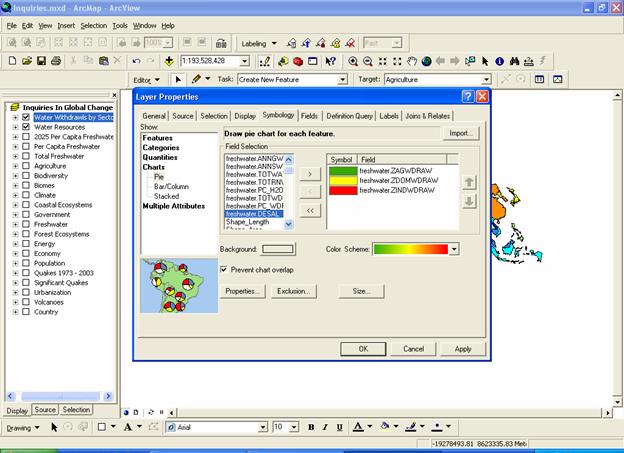
Figure 5.b.5
Creating a chart in ArcGIS
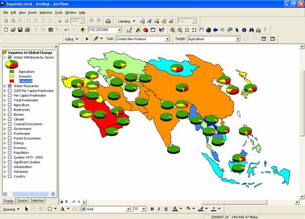
Figure 5.b.6
Creating a map of Asian water resources
Double click on the following three fields: freshwater.ZINDWDRAW (percent industrial withdrawal), freshwater.ZAGWDRAW (percent agricultural withdrawal), and freshwater.ZDOMWDRAW (percent domestic withdrawal). Make the background symbol hollow and choose an appropriate color scheme (double-click individual symbols to edit them). Click Ok and move this theme to the top of your View window, if it isn’t there already. Change the names of each category in the chart theme column by right-clicking, then left clicking on the name and retyping the name. This name will appear in your map legend.
Question 5.b.7
Which sector uses the largest proportion of total water resources in the country you selected? How does this compare with the rest of the continent?
Next, delete the second data frame that you added earlier in the lab to avoid problems in the next step. To accomplish this, right-click on the data frame name and select remove. For the Water Withdrawals by Sector view, create a display centered on your continent. When you are happy with the display, save the project and create a map layout for this view by going to View à Layout view.
Within the layout, you can adjust the size and configuration of the various components by selecting them and dragging them with the pan tool or dragging them from the corners (to resize them). You can also delete items by selecting them and pressing the Delete key. Now arrange and resize the other map objects, as you like. Create at map title by going to Insert à Title. Edit the map title (double-click on the text) to include the name of the continent and a good description of your map. Insert a legend by going to Insert à Legend and make sure that legend entries are accurate. Change names if needed by right-clicking and then left-clicking on the name of the legend item in theme column. Make sure that you insert text that tells your reader what the units are in your map. Finally, put your name on the layout using insert text.
Once you are satisfied with the appearance of your layout, go to File à Export map, then, navigate to the folder you want to save it in, and select JPEG from the pull-down menu. Then give your file a name, and press OK. This will export your layout as a JPEG image file to the location you specified. If you navigate to this file and open it, you can verify its appearance. See figure 5.b.7 for an example using the Asian continent.
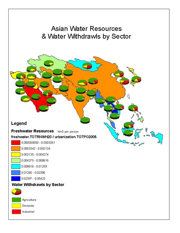
Figure 5.b.7
Example of JPEG
Question 5.b.8
Conduct an article search on water resources in your country and summarize one of the articles from the past 6 months in a short paragraph. Make sure to specifically relate the article to what you learned about your country from ArcGIS in this lab. If you can't find any articles specifically about your country, then you may choose a neighboring country to write about.
Question 5.b.9
Conduct an internet search to find a picture from your country that illustrates some aspect of what you wrote about in Question 5.b.8. Submit the layout you created and the picture from your country as a Power Point slide with your lab. Make sure the picture is fully referenced (i.e. web address where you found it) and described.
Sources
http://www.gdrc.org/uem/water/iwrm/urban-drop2.gif
http://www.sptimes.com/News/030901/photos/state-drought.jpg
http://www.worldrevolution.org/guide/desertification
http://www.users.bigpond.com/MDHIGGINS/images/Drought%20branch.jpg