Unit 3b. Earth’s Changing Biomes
Figure 3.b.1
Biomes
Objective
A biome is defined as, "a major regional or global biotic community, such as a grassland or desert, characterized chiefly by the dominant forms of plant life and the prevailing climate." There are a wide variety of biomes, including tundra, tropical and temperate rainforest, taiga or boreal forest, temperate forest, grassland, shrubland, savanna, and desert to name a few. Biomes are generally created by the interplay of temperature and precipitation in a given region on the Earth.
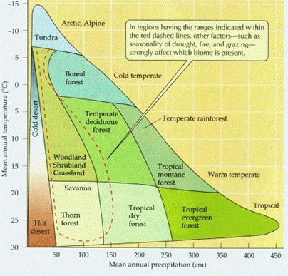
Figure 3.b.2
Biomes determined by temperature
and precipitation
In this lab we will explore how biomes are being altered due to human activities.
Introduction to Biomes
Desert and tundra biomes occupy the most
extreme environments. Both have little or no moisture and extremes of
temperature. Most deserts occur at 30o N or S latitude dry air
masses descend. Tundra occurs near the Earth’s north and south poles or on high
mountaintops. These two biomes have the lowest species richness due to the
extreme environments in which they are found.
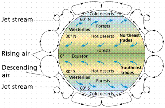
Figure 3.b.3
Biomes and wind patterns on Earth
Tropical rain forests occur in regions near the equator where the climate is warm and rainfall is high. The rain forest contains the greatest number of species and highest biomass of any biome. More than fifty percent of all terrestrial species live in this biome. Unfortunately, approximately 17 million hectares of rain forest are being destroyed every year due to deforestation. At the current deforestation rate, within 100 years these forests will have completely disappeared. Along with loosing a great deal of species diversity, this may have dramatic impacts on rainfall and climate patterns on Earth.
The temperate forest biome occurs south of the boreal
forest or taiga in eastern Asia eastern North America, and in
The shrubland or chapparal biome is dominated
by hearty evergreen shrubs that can survive the dry summers and frequent fires
that occur in parts of South America,
Grasslands occur in temperate and tropical areas with low rainfall or prolonged dry seasons. Soils in this region are deep and rich thus most of the grasslands on Earth have now been converted to agriculture.
The taiga or boreal forest extends across northern
Eurasia and
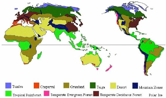
Figure 3.b.4
Map of Earth’s biomes
Exploring Forests and Agriculture
Open your Inquiries.mxd ArcGIS file. Save the file under a new name.
Copy the Forest Ecosystems theme and paste it at the top of the theme colunm (Right-click and select Copy, then Edit à Paste). Double-click on the original Forest Ecosystems theme to open the layer properties window. Under the Symbology tab, create a graduated color legend using Total forest area in 1000 ha (areaFor00) as the classification field value. Classify the legend by natural breaks into five classes and choose an appropriate color scheme and click on OK.
For the new Forest Ecosystem theme, change the name to Forest Types under the general tab in layer properties and click Apply. Under the Symbology tab, change the legend type to Charts, and create a pie chart. Create a pie chart based on Table 3.b.1.
Table 3.b.1
Natural and plantation forest area
|
Classification
Field |
Abbreviated Name |
Units |
|
Natural forest area |
areaNatF00 |
1000 ha |
|
|
areaPlaF00 |
1000 ha |
In the layer properties window (Figure 3.b.5), change the background to hollow. Decrease the maximum size of your pie chart to 12. Select an appropriate color scheme for the pie chart. You can alter each color by right-clicking on each symbol and choosing colors. When you are satisfied with you pie chart characteristics, click on OK. In the theme column, make sure that the Forest Types pie chart theme is above the Forest Ecosystem theme. Also within the theme column, you can change the names of the pieces of your pie chart by right-clicking, then left-clicking on the theme name. The name should turn blue and allow you to type in the name of your choice.
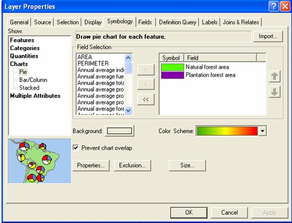
Figure 3.b.5
Creating a pie chart
Use the Zoom tool ![]() to examine individual countries or continents
and use the pan function
to examine individual countries or continents
and use the pan function ![]() to move around the globe and examine at
different areas of the map. Use the globe symbol
to move around the globe and examine at
different areas of the map. Use the globe symbol ![]() to return to the full screen view after
examining different areas of the world.
to return to the full screen view after
examining different areas of the world.
Question 3.b.1
What trends do you see in natural forests versus plantation forests around the world?
Turn the Forest Types and Forest Ecosystems
themes off. Copy the Biodiversity theme and paste it at the top of the
theme column. Within the layer properties window, under the General tab, name
your new
Question 3.b.2
What trends do you see in rates of forest change around the world? Please be specific about which areas of the world are showing forest loss and speculate on why this might be occurring.
Copy your Forest Change theme and paste it at the top of the theme column. Name the new theme Threatened Plants. Within the legend properties window, under the Symbology tab, choose legend type dot density (Figure 3.b.6). Choose Number of Threatened Plants (Plant_thr = number of plants threatened with extinction) as the dot density field. Click on the each name within the Field Selection window to see the entire name displayed. For the dot value, choose 1 dot= 1 (threatened plant). This means that for every dot that you see on the map it represents one species of plant threatened with extinction. Make sure that your background symbol is transparent and your dot size is 2. Right-click on the symbol (dot) to change the color of the dots to black, then click on the OK button.
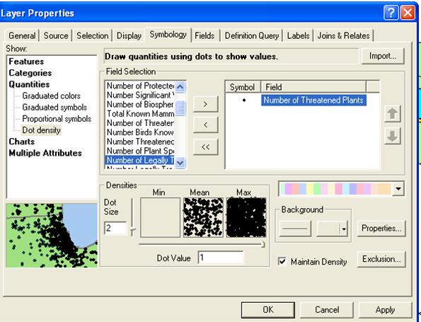
Figure 3.b.6
Creating a dot overlay
Question 3.b.3
Which regions of the world have the greatest number of threatened plants? How does the rate of forest change correspond with threatened plants?
Create a jpeg picture of
Using the zoom and pan tools, position your continent in the center of your page. Next, go to View à Layout View and your map should appear in a picture window. Insert an appropriate, title and legend using Insert.
Once you are happy with your layout, go to File à Export. Under List Files of Type: choose JPEG. Choose a place to save your map and give it an appropriate filename. Once you have saved your map open up the JPEG to check the map. In your Word document, go to Insert à Picture à From File. Then navigate to your saved JPEG picture to import it into the Word document. It should look something like Figure 3.b.7.
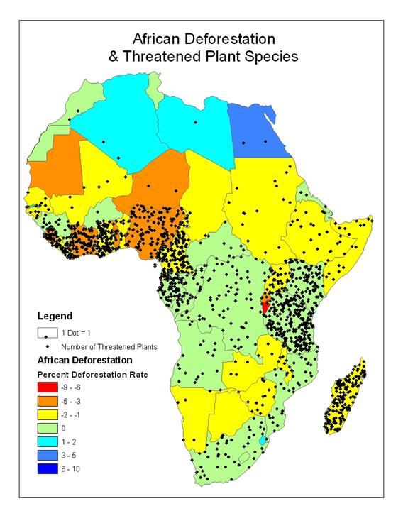
Figure 3.b.7
Layout of African forest change
and threatened plant species
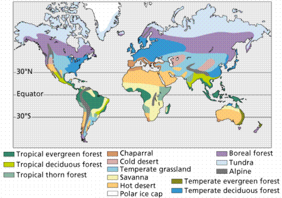
Figure 3.b.8
Map of Earth’s biomes
Exploring Agricultural Pressures
Explore how increasing agricultural pressures may be altering different biomes. First turn off the maps you have created so far. Copy and paste the Agriculture theme at the top of the themes column. Rename the new theme Cereal Production Change. Create a red to blue color map of the Total Cereals Production Change since 1992 (zchcerlpro) by selecting this as your classification field value. Classify your data into seven natural breaks. Click on the classify button and change the fourth break value to zero. This will change the scale of your legend so the red to yellow spectrum are negative (a decrease in cereal production), the green symbol is near zero (no change in cereal production since 1989-1991), and the blue colors are positive (increase in cereal production over time) as you did for Forest Change.
Question 3.b.4
What trends do you see in the
cereal production since 1992? Why might there be missing data for the countries
in the former
Copy your Forest Change theme and paste it above Cereal Production Change. Classify your data into 3 natural breaks. Click on the classify button and make your break values -1, 0 and 10 and click OK. Then right-click on each symbol in Forest Change and choose properties for selected symbol(s). Next, alter each symbol so that it is density dependent on the rate of forest change. For example in the –9 to –1% forest loss category, choose the black 10% crosshatch pattern. Next, select scrub 1 for the zero net forest change category, and choose black for the fill color, and black for the outline color. Next, click on the properties button and select no color for the background color. Use the black 10% ordered stipple category for the positive forest change or forest gain category. For the stipple pattern, make sure that your background is transparent by clicking on the properties button and selecting no color for the background. This map will allow you to see if percent forest change and percent change in cereal production are related.
Question 3.b.5
Do you see a relationship between the rate of forest change and the change in cereal production since 1992? What might be happening in countries that do not follow the same pattern?
Turn off the Forest Change theme. Copy the Forest Ecosystem theme and paste it at the top of the theme column. Double-click on the theme and open the layer properties window. Under the general tab, rename the new theme Grasslands and select Apply. Click on the Symbology tab, under quantities select dot density. Define this map using Area grasslands in 1000 ha in 1992 (Argraslnd) as the density field. In the dot value make 1 dot = 5,000. This means that for every dot shown it represents 5,000,000 hectares of grassland. Next, right-click on the dot symbol and change the dot color to black. Make sure that the Grasslands theme is above Cereal Production Change. This map should give you a sense of where the grasslands on Earth were found in 1992 and how that might relate to changes in cereal production over time.
Question 3.b.6
How do the distribution of the Earth’s grasslands relate to changes in cereal production? Where do you see exceptions to this pattern?
The Future of Threatened Biomes
Now explore the global status of the Earth’s biomes. Turn off all themes used up until this point and activate the Biomes theme.
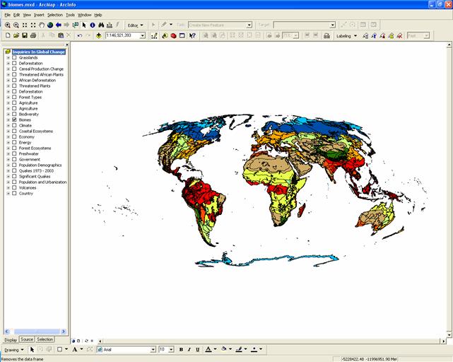
Figure 3.b.9
ArcGIS map of Earth’s biomes
Copy the Biomes theme and paste it at the top of the theme column. Rename the new theme Biome Status. Within the layer properties, select Global Status (GBL_STAT) as the Classification Field Value. The global status gives us a 30-year prediction of future conservation status given current conservation status and trajectories.
Classify the data into 4 natural breaks and define your null value (no data class) as 0 (zero) and make it gray by double-clicking in the symbol or right-clicking on the symbol and selecting Properties of selected symbol(s). Next, type the category labels in the legend as defined in table 3.b.2.
Table 3.b.2
Global status of Earth’s biomes
|
Global Status Key |
|
0 = No Data |
|
1 = Critical or Endangered |
|
2 = Vulnerable |
|
3 = Relatively Stable or Intact |
Double-click on the critical-category symbol and choose black 10% crosshatch. For the vulnerable category, choose black 10% stipple dots. Make sure that the background has no color for this category. For the intact category, choose hollow.
Make sure that the Biome Status theme is placed above the Biome theme and make sure that both themes are activated to examine the status of each biome. This theme incorporates a large amount of data so it may take some time to load. If your map stops loading uncheck and recheck your theme names and the map should appear. Use the zoom key to look at regions in more detail. The pan key is useful for moving around the map when looking at biome regions in detail.
If this overlay is too difficult for you to view you can
create a second data frame and examine both maps concurrently. Choose Insert
and select New Data Frame. Click on the new data frame and rename it Biome Frame.
Next, click on the Biome Status theme on the theme column and drag it down into the Biome Frame data frame. Alternatively, right click on Biome Status and select Copy, then select the Biome Frame data frame and choose Edit à Paste. Deactivate the original Biome Status theme. Open the layer properties window of the Biome Status theme in the Biome Frame. Change the critical category to red and the vulnerable category to yellow and click on OK.
Next select View à Layout View. The two data frames should appear with a set size in the middle of the layout page. The new frame should be highlighted with blue handles, indicting that it is the active frame. The active frame is also shown in boldface type in the theme column or table of contents. Next, resize both frames so they are the same size and do not overlap on the page. Use the Zoom tool to enlarge the maps inside the layout frame box.
Next, set the map projection of the new frame so that the new frame can have the same projection with the Inquiries In Global Change frame. Right-click on the Biome Frame data-frame and choose properties from the menu. Select the Coordinate System tab, and in the box showing the coordinate system trees, click the following links to find the coordinates system desired: Predefined > Projected Coordinate System > World > Flat Polar Quartic (world). Click OK. You will get warning but just click on the Yes button. You should be able to see the Biome Frame data frame map change shape to match the Inquiries In Global Change data frame map. Examine the status of each of the 14 biomes as in Figure 3.b.10.
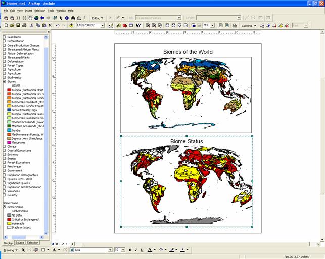
Figure 3.b.10
Layout view of Biomes of the world
and their status
Question 3.b.7
Based on the status of each biome, which biomes do you think are most at risk from human pressures? Which biomes should receive priority for conservation? Why? What strategies could be implemented to better protect Earth’s biomes?
Question 3.b.8
Using the Biome Status theme overlaid on the Biomes theme, or by using two data frames to compare Biomes and Biome Status maps simultaneously, create a JPEG layout (like you did for Africa earlier in the lab) of the continent or region that includes some of the biome that you think should receive priority for conservation. To accomplish this, use the layout view and zoom in on the region that includes the biome you selected for conservation. Make sure that your layout includes titles, legends, your name and any other relevant information.
Sources
http://www.emc.maricopa.edu/faculty/farabee/BIOBK/BioBookcommecosys.html
Major terrestrial biomes.
Image from Purves et al., Life: The Science of Biology, 4th Edition, by Sinauer
Associates (www.sinauer.com) and WH Freeman (www.whfreeman.com).
http://education.discovery.com/teacherfeature/032105biomes/freeimagebig.jpg
http://raieh.homelinux.net/imgdb/B/Biome/WhittakerBiomeDiagram.gif
http://euclid.dne.wvfibernet.net/~jvg/ENV101/Biome%20pix/biome.2.gif
http://www.emc.maricopa.edu/faculty/farabee/BIOBK/biome_alt.gif
http://cgee.hamline.edu/see/questions/dp_biosphere/bios_place/bios_world_biomes.jpg