Unit 1b. Introduction to Spatial Data Analysis with ArcGIS
Objective
ArcGIS is used in the Inquiries text to examine global and regional patterns using a large geographic information dataset. Students explore the state of the world using a global dataset, which includes information on the social and political climate that populations experience, as well as the environmental and geologic factors that shape their country. Students will examine patterns such as the level of civil liberties countries posses, to rates of urbanization, to the distribution of geologic hazards such as volcanoes and earthquakes.
This exercise is intended to acquaint you with the basic features of ArcGIS, using data on population growth and various environmental indicators. ArcGIS is the most commonly used software for working with geographic data sets. That dataset that you will be working with was compiled from data from the World Resources Institute, United States Geological Survey, United Nations Population and Urbanization Data, the World Wildlife Federation and the CIA World Factbook.
We want you to be mindful not only of the power of map tools, but the powerful ways in which data can be misrepresented or used to mislead. As you create and analyze your maps, always be critical of both the data you are using and the ways in which you are using it. This should be most apparent to you as you create legends, which you will learn about in this exercise.
While we will primarily use ArcGIS to examine global and regional patterns, you may want to focus on a specific developing country that is of interest to you.
Introduction
In this exercise you will examine the relationship between population growth and the country’s female literacy rate. Before you begin, it will be helpful to hypothesize what you think the relationship between the two will be.
- Run ArcGIS
- Open the Inquiries ArcGIS File
Before proceeding further, save your project. Under File, choose Save Project As…. Make sure the appropriate drive is selected in the bottom right pull-down menu before you click OK. Name the file something that will help you remember what it is in the future (intro_ArcGIS, etc). Save each lab as a different name to ensure that your original ArcGIS dataset is not altered for subsequent labs. Also, it is a fact of life that computers crash so, save intermittently as you are working!
Click on the check box next to Demographics to see a world map. It should look like Figure 1.b.1.
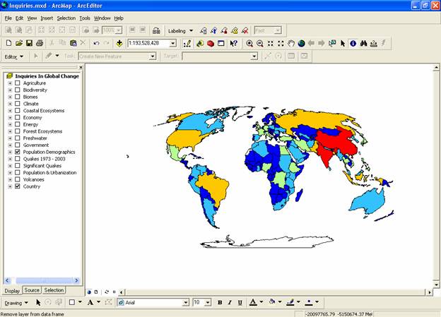
Figure 1.b.1
ArcGIS interface with map of global population
Next, open the attribute table for Demographics by right-clicking on the theme name from the theme menu and selecting open attribute table. The attribute table associated with a given theme stores all of the raw data used to create and normalize the maps we make and manipulate. By scrolling through the table you can see all of the categories of data that are available and all of the countries that the map represents. Cells that have <Null> are categories where data is unavailable. Close the attribute table when you are finished examining the data.
Now we want to customize the map. Copy the Demographics theme by right-clicking on it. Go to Edit à Paste. Paste two copies of the Demographics theme at the top of the theme column. Unclick your original Demographics theme. By making copies of themes, we can always go back to the original theme if a mistake is made. Of your two new themes at the top of the theme column, double-click on the bottom Demographics theme. The Layer Properties window should now appear (Figure 1.b.2).
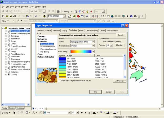
Figure 1.b.2
Layer Properties
We want to start by creating a map, which compares the countries by the percentage of women who are literate. First click on the General tab of the Layer Properties window and rename your theme Female Literacy Rate. Click Apply. Then click on the Symbology tab. To illustrate the percentage of females who are literate, on the right side of the Layer Properties window, under Quantities, choose Graduated Color. Then choose Female Adult Literacy Rate (percent of adult females that are literate in 2002) as the fields value.
Set your Classification to five classes. Then press the Classify button a window should appear that looks like Figure 1.b.3. Make sure that your classification choice does a good job of representing your data by looking at the histogram. You can change category sizes by altering the break value numbers in the box to the right of the histogram, or by dragging the classification lines within the histogram. Once you are satisfied with your classification fields press OK to close that window.
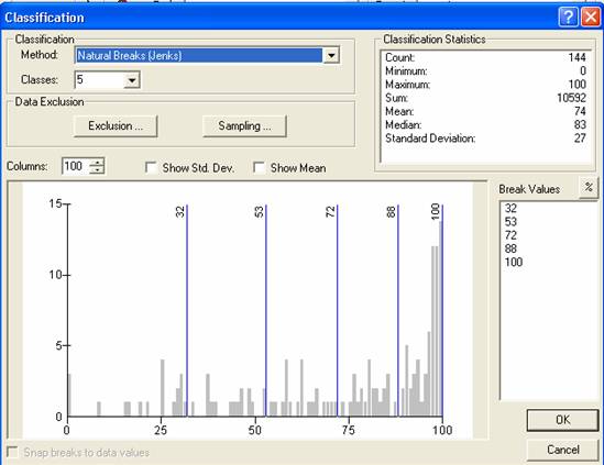
Figure 1.b.3
Classification
Next, if you are not satisfied with the colors representing each field, you can change them by altering the color ramp. Alternatively, you can right-click on each of the symbols. Then select Properties for Selected Symbol(s). Next, choose the fill color of your choice and select OK. When you are satisfied with the colors in your classification field, click on OK. Note that in this dataset, the Country theme shows the outline of each country and those countries that are colored white are in the no data class (null data); i.e. there is no data for that country.
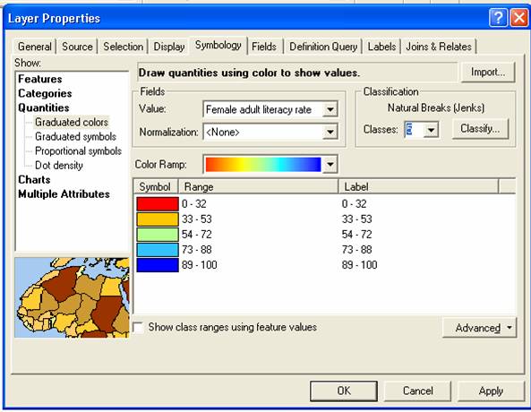
Figure 1.b.4
Female Literacy Rate fields
You should now see a map of the countries of the world where each country is coded by the percent of adult women in each country that are literate (be sure that the top Demographics theme is un-checked to see Female Literacy Rate. Your map should look like Figure 1.b.5.
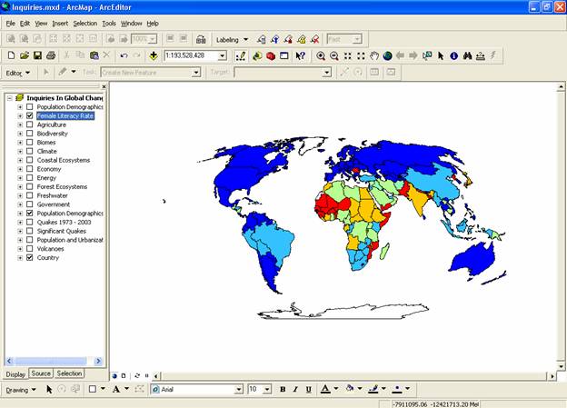
Figure 1.b.5
Global map of literate adult females
For the second Demographics theme, we are interested in looking at the population change over time. Double-click on this theme and in the layer properties, general tab, change the name of this theme to Population Change 2000-2005 and press Apply. Then under the Symbology tab, classify a graduated color legend with 2000-2005 Total Average Annual Population Change as the value field. Make sure that you have selected three natural break (jenks) classes, then press the classify button. Natural Breaks asks ArcGIS to find gaps in the data values and clump the data according to its naturally occurring groups of values.
Next, type in 0 as the top value in the break values box next to the histogram. Your break values should be 0, 1.9 and 4.9. Click OK.
Now manually change the graduated color legend to a patterned legend by editing each individual symbol. Right-click on each symbol, then select properties of selected symbol(s). Make the negative population change 10% ordered stipple, the 0.1 - 1.9 change 10% simple hatch, and the 2.0 - 4.9 category 10% crosshatch as in Figure 1.b.6. Make sure that the background for each of the patterns is transparent by clicking on the properties button.
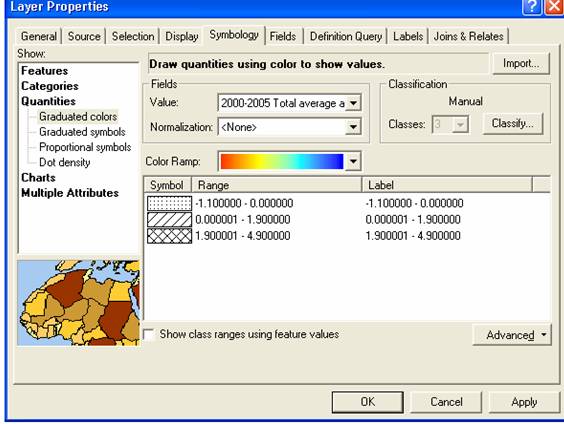
Figure 1.b.6
Population change theme
Make sure the Population Change 2000-2005 theme appears above the women’s literacy theme in the view window. If it doesn't, click and drag the legend for Population Change 2000-2005 up to the top. Examine the resulting map overlay.
Question 1.b.1
What is the apparent relationship between population change and female literacy rate? Explain how this relationship works. You may want to examine Figure 1.b.7 to help answer this question.
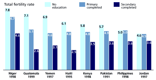
Figure 1.b.7
Women's Education and Family Size in Selected Countries,
1990s
Another way
to explore this relationship is by looking at the fertility rate or the number
of births per woman in her lifetime with female literacy rate. Copy the
theme Female Literacy Rate (Right-click
à Copy) and
paste it at the top of the column of themes (Edit à Paste). Rename your theme Fertility 2005 by altering the theme name under
general tab in layer properties. Under the Symbology tab, change the value
field to Total Fertility Rate 2000-05. Next, right-click on the symbols
and select Flip Symbols. Click OK. Your map should now look like Figure 1.b.8.
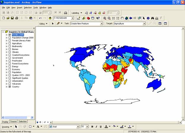
Figure 1.b.8
Map of global female fertility in 2005
Since Africa stands out in this map, as well as for rates of
female literacy, explore
Within the layer properties of your two new themes, limit
the coverage to
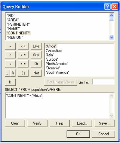
Figure 1.b.9
Query Builder window
You can avoid typing this in by double-clicking the
Continent field in the Fields window (it should appear in the formula box
below), then clicking the equal sign, and then double clicking on your
continent of choice in the Values window. All parts of the map except for ![]() to obtain the same sized map as in Figure
1.b.8.
to obtain the same sized map as in Figure
1.b.8.
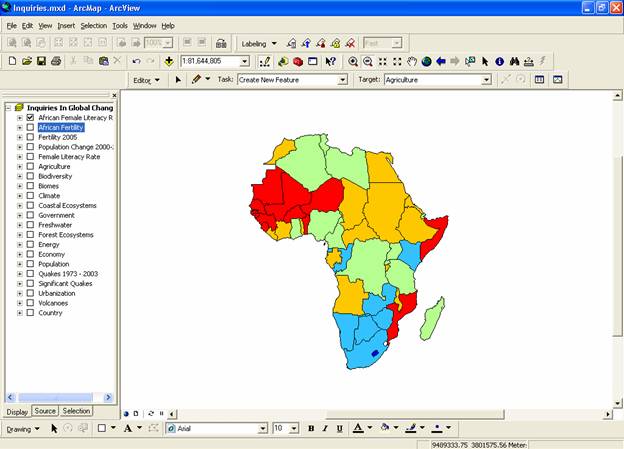
Figure 1.b.8
Map of query for
When you have completed queries for both African Female Literacy and African Fertility 2005, click back and forth between the two maps to examine whether there is a relationship between female literacy and fertility.
Another option to examine data is to create a second data
frame so you can examine two maps concurrently. First, click on the layout view
icon (![]() )
in the lower left of the display area to switch from the data view to the
layout view. Alternatively, go to view
on the menu bar and select Layout view. Also on the menu bar, choose Insert and
select New Data Frame. Double-click on the new data frame and rename it
)
in the lower left of the display area to switch from the data view to the
layout view. Alternatively, go to view
on the menu bar and select Layout view. Also on the menu bar, choose Insert and
select New Data Frame. Double-click on the new data frame and rename it
The new data frame should appear with a set size in the middle of the layout page. It should be highlighted with blue handles, indicting that it is the active frame. The active frame is also shown in boldface type in the theme column or table of contents. Resize both frames so they are the same size and do not overlap on the page. Use the Zoom tool to enlarge the African Continent inside the layout frame box without cropping any of the continent edges. To zoom in on a map click on the zoom magnifying glass, then draw a box around the continent you want to zoom in on.
Next, click on the African
Fertility 2005 theme on the theme column and drag it down into the
To do this, right-click on the
Select View à Zoom layout to increase the size of your maps. You can add relevant text to the map by selecting Insert à Title, Legend etc from the menu bar. See figure 1.b.9 for an example comparing two data views.
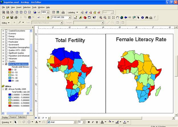
Figure 1.b.9
Comparing data frames
Now choose one country in ![]() )
and clicking on the country of interest.
)
and clicking on the country of interest.
Question 1.b.2
Is there a general relationship between African female literacy rate and total fertility rate? Name the African country that you selected to examine. What are the rates of female fertility and literacy for that country?
Question 1.b.3
Go to the CIA World Factbook (http://www.cia.gov/cia/publications/factbook/) and look up more information about the African country you selected. Use this information to determine some of the reasons behind the country’s fertility and literacy rates. Write a paragraph about the country you selected examining these relationships.
Summary of ArcGIS
In this exercise we have developed skills to create and navigate views, create and edit legends, choose data classification types and create data queries. This information will be important for other ArcGIS exercises.
Sources
http://www.prb.org/Content/NavigationMenu/PRB/Educators/Human_Population/Women/The_Status_of_Women1.htm