Unit 11b. Inequality and Civil Liberties
 Objective
In this lab you will examine the relationship between
population growth in individual countries and their economy, level of
education, and the amount of civil liberties they enjoy. Before you begin,
it will be helpful to hypothesize what you think the relationships between
these factors may be. Hypothesize about the relationship for a free
country such as
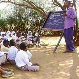
Figure
11.b.1
Children in school
Dictionary.com has seventeen different definitions for the word free. When we think about freedom in this lab the lines will be somewhat fuzzy; however, we can define a free country as one that is “…governed by consent and possessing or granting civil liberties.” Countries that are partially free may have some aspects of a free society such as an elected government yet have very few civil liberties or vice versa. Lastly, a society that is considered not free may have neither an elected government nor civil liberties for it citizens.
|
Year |
1993 |
1998 |
2003 |
|
Free |
72 |
88 |
88 |
|
Partly Free |
53 |
53 |
55 |
|
Not Free |
55 |
50 |
49 |
|
Total |
150 |
191 |
192 |
Table 11.b.1
Global Trends in Freedom – Countries Free by Year from Freedom House
Exploring Education with ArcGIS
First, choose a country in the developing world that interests you. Open the Inquiries.mxd ArcGIS file and save the file under a new name. Copy the Demographics theme and paste a copy at the top of the theme column, in the table of contents (Right-click à Copy; Edit à Paste). Leave the original Demographics theme as it is so you can make other copies of it as needed.
To tell the difference between the original Demographics theme and the new one, change the names of the theme. A quick way to change the name of a theme is to right-click on the name, then left-click on the name with the mouse. This action should bring a curser into the theme name box. Change the theme name of the first Demographics theme to Female Literacy Rate, and click on the check box next to the theme to activate it. Double-click on the Female Literacy Rate theme to open the layer properties window.
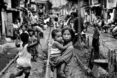
Figure
11.b.2
Young mother in
Create a map that compares the countries of the world by the percentage of women who are literate. Under the Symbology tab, select Female adult literacy rate (percent of adult females that are literate in 2002, F_litrt_02) as the classification field value.
Then under color ramp choose yellow to brown dichromatic. Select four natural breaks as the classification. Next, press the Classify button and write down the first three break values of the Female Literacy Rate theme. We will use these numbers to compare to male literacy rates around the world. Once you have finished press OK, two times to return to your map view. You should now see a map of the countries of the world where each country is coded by the percent of adult women in each country that are literate.
To view how female and male literacy rate differ around the globe, add a new data frame so we can view two maps simultaneously. In the toolbar click on the Insert button and select Data Frame. Click on the new data frame and rename it Males. Drag the Female Literacy Rate theme and the Country theme from the Inquiries in Global Change data frame down to the new Pop Change data frame.
Right-click on the new data-frame and choose properties from the menu. Select the Coordinate System tab, and in the box showing the coordinate system trees, click the following links to find the coordinates system desired: Predefined > Projected Coordinate System > World > Flat Polar Quartic (world). Click OK. You will get a warning but just click on the Yes button. The new data frame map should change shape to match the Inquiries In Global Change data frame map.
Under the Males data frame, open the layer properties window for the Female Literacy Rate theme. Under the general tab, rename the theme Male Literacy Rate. Next, under the Symbology tab, change the classification field value to Male adult literacy rate (M_LITRte_0). Classify your data as four natural breaks. Click on the Classify button and change the first three break values to those that you recorded for the female rates. This will facilitate making a direct comparison between the two maps.
Recall that the frame that is highlighted in bold is the active frame, so if you do not see changes in your map as you make changes in your layer properties, you may not have the theme you are working in activated. To activate a data frame, right click on the data frame name and select activate. Once you have both maps set up with the same projection and with a similar classification type, change from the data view to the layout view by selecting View à Layout view. You should see both maps on top of one another.
Next, resize each of your maps so they are the same size and do not overlap. Add titles to your maps as well by using Insert à Title. Add a legend to your layout using Insert à legend as in figure 11.b.3. Remember that the legend inserted will be from the active frame. When you are satisfied with your map, export it as a JPEG (File à Export Map) and turn it in with your homework.
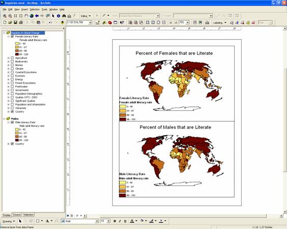
Figure
11.b.3
Layout comparing global male and female literacy rates
Question
11.b.1
Can you draw any conclusions about the differences between the male and female literacy rates? Compare the country you selected with other countries in the same region and globally. What are some plausible reasons behind the differences in literacy rates between males and females for your country?
Make a copy of the
Male Literacy Rate theme and turn off the original. Rename the new theme
Population Change. Open the layer properties window and under the Symbology tab, select 2000-2005 Total average annual
population change (AVGCHG_05) as the classification field value. Classify
the data into three natural breaks. Click on the classify button and change the
first break value to zero. This will make the first legend value for your map
negative population change or a decrease in population growth. Click on OK
twice to view your maps. Alter your title in your layout to reflect the new
map.
Question
11.b.2
Is there a relationship between female literacy rate and population change? What might be causing this trend?
Economy and Population
Now explore the relationship between Economy and Population. Keep the Population Change theme on but turn off the Female Literacy Rate theme. Copy the Economy theme and paste it at the top of the theme column.
Change the name of the new Economy theme to Per Capita GDP. Select Per Capita GDP (in 2000, Pc_gdp00) as the classification field value for the theme. Choose an appropriate color scheme and classification type. Recall that having a similar classification scheme for maps that you would like to compare makes the comparison process much simpler. Also note that you can flip the symbol colors by right-clicking on the symbols in the layer properties window and selecting Flip symbols.
Make a copy of the Per Capita GDP theme and name the theme GDP by Sector. Under the Symbology tab, select Charts and Pie as the legend type in the GDP by Sector theme. Using the field selection, create a pie chart of:
|
Classification
Field Value |
Abbreviated Name |
Units |
|
% GDP by Agriculture in 2000 |
GDP_ag00 |
Percent |
|
% GDP by industry in 2000 |
GDP_ind00 |
Percent |
|
% GDP by services in 2000 |
GDP_svc00 |
Percent |
Table 11.b.2
Percent GDP by agriculture, industry and services
In the legend editor properties, you may need to decrease
the maximum size of your pie chart, in addition, make sure to make the
background color for your pie chart hollow. Move the GDP by Sector pie
chart theme above the Per Capita GDP theme. Zoom ![]() in on the continent that contains the country
you selected (by drawing a box around the continent) to examine to see
individual pie charts for each country on your continent as in Figure 11.b.4.
in on the continent that contains the country
you selected (by drawing a box around the continent) to examine to see
individual pie charts for each country on your continent as in Figure 11.b.4.
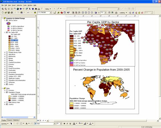
Figure
11.b.4
Layout comparing per capita GDP and population change
If you prefer you could also use the Query Builder to only
view the continent or region that contains the country you selected to examine.
To do this, open the layer properties window and select Definition Query. Use
the Query Builder and select a region to explore. Create a query equation for
the region you want to examine. For example, to examine Western Africa, your
query definition should read: [REGION] = '
Question
11.b.3
Is there a relationship between population change and per capita gross domestic product (GDP)? Explain why or why not.
Turn off the Per Capita GDP theme and turn the Female Literacy Rate theme back on.
Question
11.b.4
Is there a relationship between how a country obtains its GDP and the female literacy rate? Is there a dominant sector for obtaining GDP for the country you selected to examine? How does this connect back to population dynamics?
Now explore how government fits into the relationship between economics and population dynamics. Copy the Government theme and paste a copy at the top of the theme column. Change the Government theme name to Civil Liberties. After the name has been changed double click on the theme and classify this theme by Level of Civil Liberties 2002 (with 1=most free, 7= least free, Lib02). Choose an appropriate color scheme and classify your data by 7 natural breaks.
Make another copy of the Government theme. Rename this new theme Expenditures. Make a pie chart of government expenditures (Table 11.b.3) using the same process that you used for GDP by Sector.
|
Classification
Field Value |
Abbreviated Name |
Units |
|
Government expenditures on military |
%miltry00 |
Percent |
|
Government expenditures on public health |
%pubhlth |
Percent |
|
Government expenditures on education |
%educ |
Percent |
Table 11.b.3
Government expenditures on military, public health and education
Move the Expenditures pie chart theme above the Civil
Liberties to examine the government
expenditures. Zoom ![]() in on the continent that contains your country
to see individual pie charts for each country on your continent. Make sure
you’re your legends and titles are appropriate. When you are satisfied with
your map, export it as a JPEG (File à Export Map) and turn it in with your homework.
in on the continent that contains your country
to see individual pie charts for each country on your continent. Make sure
you’re your legends and titles are appropriate. When you are satisfied with
your map, export it as a JPEG (File à Export Map) and turn it in with your homework.
Question
11.b.5
Do you see any relationships between government expenditures, civil liberties and population change?
Question
11.b.6
Use the CIA's World Factbook (http://www.cia.gov/cia/publications/factbook/)
and the information tool (![]() ) to
research your country's profile. What did you discover that might give you
context to interpret civil liberties, female literacy rate, and the economy in
regards to annual population growth in your country or region?
) to
research your country's profile. What did you discover that might give you
context to interpret civil liberties, female literacy rate, and the economy in
regards to annual population growth in your country or region?
Question
11.b.7
How do societies benefit from women gaining access to more education, civil liberties, economic opportunities, and political and social power?
Question
11.b.8
It is increasingly clear that the
long-term future of environmental and human health is dependant on the
empowerment of women. What political and social steps can be taken to improve
access to education, economics, political power and civic freedom for women? What would you do to increase education and civil
liberties in your country?
Other Resources
Small Fortunes – A documentary about how microcredit is empowering poor people, especially women, who do not have access to the traditional economy. http://www.pbs.org/kbyu/smallfortunes/
Sources
http://education.guardian.co.uk/galleryguide/0,6606,132055,00.html
http://www.ers.usda.gov/amberwaves/june04/features/images/asiapacific.jpg
http://www.worldrevolution.org/guide/inequality&h=250&w=377&sz=79&tbnid=SztsvUE54roJ:&tbnh=78&tbnw=118&start=25&prev=/images%3Fq%3DInequality%26start%3D20%26hl%3Den%26lr%3D%26rls%3DGGLD,GGLD:2004-37,GGLD:en%26sa%3DN
http://www.freedomhouse.org/research/specreports/ar2004.pdf
http://freedomhouse.org/survey99/map/
http://www.worldrevolution.org/feature/sudancrisis.htm
http://www.mrtoddbridges.com/mediac/400_0/media/AWB00248.jpg