Appendix II. Guide to Basic ArcGIS Features
The ArcGIS Interface
When ArcGIS starts up, you will see themes running down the left in a column and a map of the world in the view window. If there is no map displayed click on the small gray box in the upper left hand corner of a theme. Figure AII.1 shows the Inquiries in Global Change data frame.
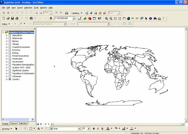
Figure AII.1
View in ArcGIS
Database Files
For each theme that we work with (e.g. population, energy), there will be a database file (.mdb). The database files are spreadsheets that associate spatial data with map features (in this case, countries of the world). They can be opened in spreadsheet applications like Excel.
ArcMap Files
When you create and analyze maps in ArcGIS, you will want to save ArcMap files (.mxd) to your directory. Project files do not actually contain data or geographic references. They are simply links to various themes, and instructions for how to display them. A project file may contain views, tables, charts, and layouts.
Projects
When you first start ArcGIS, a new untitled ArcMap window is opened. You may either begin a new project (the default option) or open an existing ArcMap project file.
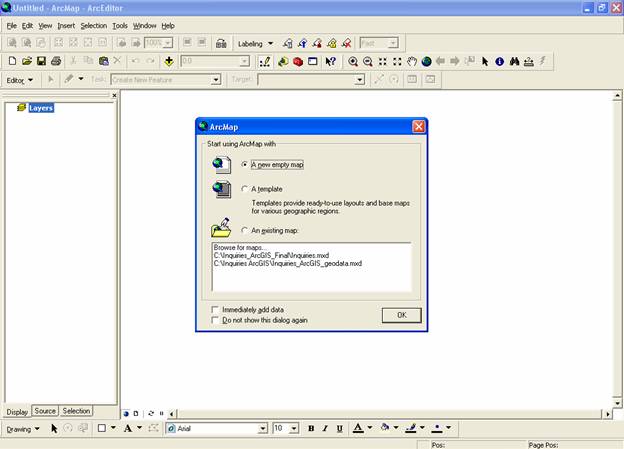
Figure AII.2
Opening ArcMap
- To open an existing project file, go to the File menu, and select Open or click on An existing map.
- To save, select Save Project (or click on the floppy disk icon). Remember to save your projects often, so that they are not lost if your computer crashes.
Data Frame
To view one or more themes select the Data Frame icon in the project window to make it active. A data frame (as in data frame Figure AII.1) displays a collection of themes and your world map. You change your map to your specifications in a view. A table is a database file that can be edited, queried or joined with other tables. A chart is a pie graph, histogram or other type of graph representation of a table. A layout is a map presentation, complete with a compass arrow, scale bar and legends. You may either print a layout or save it as a graphics file.
Creating New Data Frames
- Click on the Insert then select data frame. A blank view window should appear, as well as a new menu and toolbars. You can change the data frame properties by double clicking on the name.
Deleting Data Frames
- In the project window, select the view to be deleted.
- Right-click on the data frame and select remove.
Adding Themes to a Data Frame
- Click
on the add theme button
 on
the top tool bar.
on
the top tool bar. - Navigate to the folder that contains the new themes. All applicable files should be displayed in the left hand window. Highlight the file you want and click OK.
- Click on the box to the left of the file name to activate the theme.
- You may add several themes to a view, but they will be drawn from the bottom up, so colors and patterns on the top theme will over-write the bottom themes. To change the order of your themes, simply click and drag them to the right place.
- You may increase the space allocated for the legend by clicking and dragging the center bar.
Deleting Themes from a Data Frame
- From the data frame window, click on the name of the theme to be deleted.
- Right-click on the name and select remove.
Moving and Copying Themes
- To move a theme within the data frame, click and drag the theme to the desired location.
- To copy a theme, right-click on the theme and select Copy. Then go to Edit and select paste.
- The theme will appear at the top of the theme column.
Modifying Theme Displays (Legends)
After a theme is activated, you will generally want to change the display so that the map is colored in a way that represents the data of interest. This is done by editing the map’s layer properties. You have the option of saving your legend to a legend file (.avl), and should do so if you plan to use the same legend again, or if it took a long time to create.
- From an open view window, double-click on the theme of interest. A dialogue box entitled Layer Properties should appear.
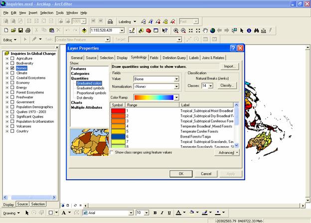
Figure AII. 3
Layer Properties
- You may either import an existing legend or create your own. To use an existing legend, click on the Import button under the Symbology tab, and select the proper directory and filename.
- To create a new legend, first choose the legend type.
- Categories legends are used when you do not need to distinguish the map features from each other. This means each country is colored the same.
- Quantities legends are used for variables that take on relatively few values (almost always integers or descriptive variables). For example, each country is coded according to continent. Since there are only eight continents, it makes sense to assign a different color to each unique value (continent).
- Charts legends are used to make pie charts, bar/column charts or stacked bar charts.
- Next choose the Classification Field Value by scrolling through and clicking on the variable of interest.
- For graduated color legends, click on the Classify button to choose a classification type and the number of classes. There are several different classification types:
· The Manual classification method allows the user to choose where each break occurs manually.
· The default classification method is Natural breaks (Jenks), which finds groupings and patterns inherent in your data.
· The Equal Interval method divides the range of attribute values into equal sized sub-ranges.
· The Defined Interval method divides the range of attribute values into an interval that you select.
· In the Quantile classification method, each class contains the same number of features. Quantiles are best suited for data that does not have disproportionate numbers of features with similar values.
· With Equal Area classification, data are grouped such that the total area of the polygons in each class is approximately the same.
· The Standard Deviation classification method divides the attribute values by the standard deviation for the data.
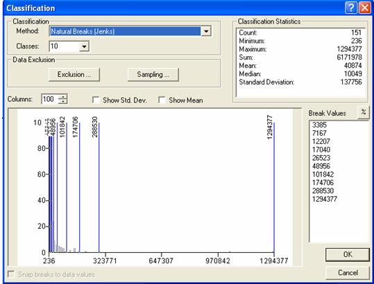
Figure AII.4
Classification window
- Color your legend by selecting a Color Ramp (Graduated Color legends only) or Color Scheme (Unique Value legends only), or by manually editing the symbol for each class.
- To edit a symbol manually, double click on the colored box, and a set of palettes will appear on the screen (Figure AII.5). You can also edit symbols by right-clicking on the symbol and selecting Properties for Selected Symbol(s) or Properties for all symbols.
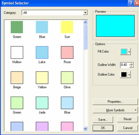
Figure AII.5
Symbol Selector window
The Symbol Selector allows you to choose a pattern or color for polygon shading. Choose Hollow for transparent symbol shading. Patterns are useful when overlaying two or more themes. Select Properties to look at the fills in more detail.
- If your database file has missing values, they will show up in the attribute table as <Null> values.
- After you have created a legend, click on the Apply button to activate it. If you want to save the legend (often a good idea if you made a lot of manual changes and plan to use it again), click on the Save button.
Manipulating Views
ArcGIS data can often be manipulated by right-clicking on the theme name (Figure AII.6), symbol of interest (Figure AII.7) or within the attribute table (Figure AII.8).
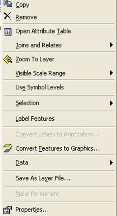
Figure AII.6
Window of options available from right-clicking on the theme name
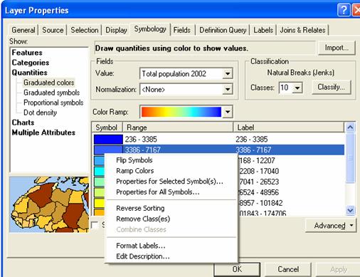
Figure AII.7
Window of options available from right-clicking on the symbols within the layer properties window
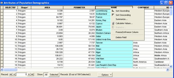
Figure AII.8
Window of options available from right-clicking on the category name within the attribute table
The ArcGIS toolbar contains a set of tools that are used to view and manipulate data frames, layouts and charts. Toolbars can be customized by selecting View à Toolbars.
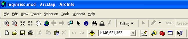
Figure AII.9
ArcGIS toolbar example
By hovering over each symbol with the mouse, a box will appear that tells the user what each tool is used for. Examples of selected tools are below:
![]() Identify tool is used to display
the attribute values of a feature shown in a view, table or chart. With the WRI maps, you can use it to click on a country and find out
its name and associated data.
Identify tool is used to display
the attribute values of a feature shown in a view, table or chart. With the WRI maps, you can use it to click on a country and find out
its name and associated data.
![]() Pointer tool is used to select,
move and resize graphics. It is the default tool option, but you will use it
most for editing layouts.
Pointer tool is used to select,
move and resize graphics. It is the default tool option, but you will use it
most for editing layouts.
![]() Zoom in tool is used to zoom in on
an area of a view or layout that you define by clicking on a point, or dragging
a box with the mouse.
Zoom in tool is used to zoom in on
an area of a view or layout that you define by clicking on a point, or dragging
a box with the mouse.
![]() Zoom out tool is used to zoom out
on a view or layout, centered on a position you choose by clicking on a point.
Zoom out tool is used to zoom out
on a view or layout, centered on a position you choose by clicking on a point.
![]() Pan tool lets you pan a view or
layout by dragging the display in any direction with the mouse.
Pan tool lets you pan a view or
layout by dragging the display in any direction with the mouse.
![]() Measure tool measures distance on a
view. After clicking on the tool button, click on a point, drag the mouse, and
release on the second point. The distance is indicated on the bottom of the screen,
in the distance units you set in the view properties dialogue box.
Measure tool measures distance on a
view. After clicking on the tool button, click on a point, drag the mouse, and
release on the second point. The distance is indicated on the bottom of the screen,
in the distance units you set in the view properties dialogue box.
![]() Zoom to Full Extent: Zooms to the full
extent (size) of all themes in a view.
Zoom to Full Extent: Zooms to the full
extent (size) of all themes in a view.
![]() Zoom In: Zooms in on the center of a
view or layout by a factor of two.
Zoom In: Zooms in on the center of a
view or layout by a factor of two.
![]() Zoom Out: Zooms out from the center
of a view or layout by a factor of two.
Zoom Out: Zooms out from the center
of a view or layout by a factor of two.
Querying Views
Querying allows you to limit the global data set to only those elements you select. For example, you may want to select a certain continent.
Within the Layer Properties window, click on the Definition
Query tab and then click on the Query Builder button. In the Query Builder
window (Figure AII.10), double-click on Continent. Then click on the Get Unique Values button. This should bring up the different continents
of the world. Use the query tool button to define the Theme by the
countries located in a particular continent with the following syntax:
"CONTINENT" = '
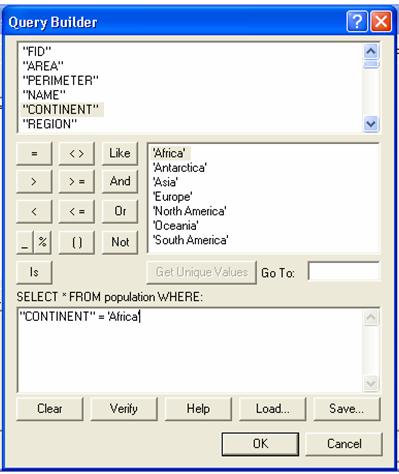
Figure
AII.10
Query Builder window
You can avoid typing this in by double-clicking the Continent
field in the Fields window (it should appear in the formula box below), then
clicking the equal sign, and then double clicking on your continent of choice
in the Values window. All parts of the map except for
Tables
To access and edit the data associated with your themes, you need to work with tables.
Opening a Table
Right-click on the theme name of interest and select open attribute table.
Joining Two Tables
The join command allows you to merge two tables within your project. The database files will not be changed, but whenever that particular project is opened, the tables will be joined.
- Double-click on the theme that you would
like to join another table to, to open the layer properties window. Next
go to the Joins & Relates tab. In the first pull down menu, select
Join attributes from a table.
- In the second pull down menu select the
theme that will be added to the theme of interest, (i.e. join the Urbanization
table to the Freshwater table).
In the third pull down menu, select name, then click ok (Figure
AII.11).
- The program may ask you to create an
index. Select yes. Then click on Apply. This should join the Urbanization and Freshwater attribute tables into
one table so you can explore Per
Capita Freshwater resources for example.

Figure AII.11
Joining data tables
Sorting a Table
- Highlight the name of the field by which you wish to sort.
- Right-click on the field name and select Sort Ascending (smallest on top) or Sort Descending (smallest on bottom), depending on your preference.
- The table should now be sorted, and remain sorted within that particular project.
Obtaining Statistics for a Table
For any field in a table, you can obtain the following statistics: sum, count, mean, maximum, minimum, range, variance and standard deviation. These statistics can be helpful in determining what type of classification to use in a legend.
- Highlight the name of the field for which you want to obtain descriptive statistics.
- Right-click on the field and select Statistics. A dialogue box with statistics should pop up.
Editing a Table
To edit the data in the attribute table, or to add new data (i.e) replace a null value in the dataset.
- Go to the Editor button and select Start Editing. A window will open that will ask which theme you would like to edit.
- Select the appropriate theme name.
- Return to the attribute table and you should be able to type in the new data as you would in an Excel spreadsheet. When you are done editing the attribute table, select Save Edit from the Editor pull down menu.
- Close the theme you have edited and reopen it to see the new data incorporated into your map.
Layouts
Layouts can be used to prepare views, charts, tables, and other graphics for output from ArcGIS. Select View à Layout View to change from the Data View to the Layout View.
- To examine data in the layout view, it is useful to create a second data frame so you can examine two maps concurrently. Go to View on the menu bar and select Layout View. Also on the menu bar, choose Insert and select New Data Frame. Double-click on the new data frame and give it an appropriate name.
- The new data frame should appear with a set size in the middle of the layout page highlighted with blue handles, indicting that it is the active frame. The active frame is also shown in boldface type in the theme column or table of contents. Next, resize both frames so they are the same size and do not overlap on the page. Use the Zoom tool to select the appropriate sized map inside the layout frame box.
- Next, click on one of the themes that you would like to compare and drag it down into the new data frame. Set the map projection of the new frame so that the new data frame has the same projection with the Inquiries In Global Change frame. Right-click on the new data-frame and choose properties from the menu. Select the Coordinate System tab, and in the box showing the coordinate system trees, click the following links to find the coordinates system desired: Predefined à Projected Coordinate System à World à Flat Polar Quartic (world). Click OK. You may get warning but just click on Yes button.
- This should change the new data frame map to match the Inquiries In Global Change data frame map. Select View à Zoom layout to increase or decrease the size of your maps. Recall that you can add relevant text to the map by selecting Insert à Title, Legend etc from the menu bar.
For presentation purposes, you may want to create a JPEG map of your layout. A layout JPEG typically may include a title and legend.
Figure AII.12
Example of a JPEG layout
Editing and Exporting Layouts
Layout edits are generally performed with the same set of tools that you would modify the data view. Use the Insert button to add titles, graphics, charts and text to your layout. When you are satisfied with your layout go to File à Export Map. Save your file as a JPEG. Navigate to your new JPEG view and print it. These JPEGs can be used in PowerPoint presentations or any word document.
Adding a Chart to a Layout
To do this, open the layer properties window of the theme of interest. Create a Definition Query for the particular region of interest. Next, open the Attribute table of the queried theme. You should only see countries in the table that are present in that region. At the bottom of the attribute table, click on the Options button and select Create Graph (Figure 8.b.3).
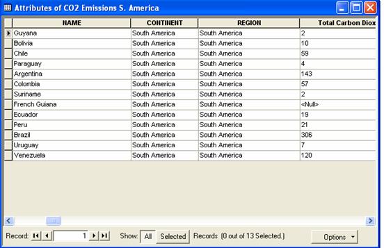
Figure AII.13
Attribute table
Select a column graph and choose next. Uncheck all categories in the middle lower box, then check the box next the emissions category that you would like to graph (Figure 8.b.4). Click on the next button.
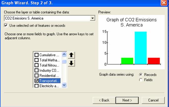
Figure AII.14
Selecting the category to graph
Click on next button and choose an appropriate title for the graph. Check all three boxes on the left side below the title and subtitle. Next, click on the Advanced Options button and insert appropriate axes labels (Figure 8.b.5) and click on Apply Now. Next, click on the trends tab and insert a mean line on the graph and hit OK.
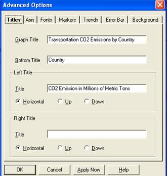
Figure AII.15
Selecting the category to graph
Lastly, make sure that the three buttons are checked underneath the title and subtitle. In addition, make sure that the Show Graph on Layout button is checked (Figure 8.b.5). Click on the Finish button. The chart should be visible on the layout. Resize the chart to fit in the bottom layout box.
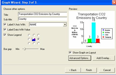
Figure AII.16
The final step to inserting a graph in the layout
When you are finished with your layout, you can export your layout map as a JPEG under File à Export Map. Make sure to save your map as a JPEG.
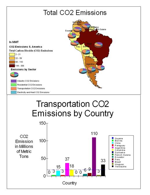
Figure AII.16
Example JPEG Layout
ArcGIS Help
ArcGIS's help system is very
user-friendly. To find out more information about any ArcGIS feature, simply
click on the help button ![]() and
then the toolbar button or menu item of interest. To search for help on a
particular subject, go to the searchable help index by selecting Help
and then Help Topics from any menu.
and
then the toolbar button or menu item of interest. To search for help on a
particular subject, go to the searchable help index by selecting Help
and then Help Topics from any menu.
Last
updated: 6/1/2006 10:50 AM